Sometimes, less is more. And Victoria Tate of Victoria Isabel Photography certainly saw beauty in the whitewashed exposed brick, wood floors and pure winter light that poured into Zurie, the spot where she selected for her romantic, fine art-inspired anniversary vision to play out. Victoria says, “The delicate tablescape paired perfectly with details such as the bride's Alvina Valenta gown. Like the purpose of WeddingDay Magazine, we aimed to provide content that pushed couples to step out of their box and realize the potential of simplicity and the big statement it can make."




Victoria explains, “The loose florals complemented the flow of the velvet table runner along with the clean flatware and plates. It all brought together the play on texture that I strived for: brick, glass, porcelain, gold, chiffon, silk and velvet. Who would have known so many textures could come together and create something so soft and airy!”


“First and foremost, since the couple was married, we wanted a gown that was the complete opposite of what the bride originally wore on her wedding day,” says Victoria. “Her original gown was high on the collar with cap sleeves and lots of beading. It’s because we chose a different gown that we were able to get such a genuine reaction out of her groom on shoot day. The dress we went with was an Alvina Valenta and has such simple yet exquisite details…just like the vision of the shoot. While playing on with the idea of having many shades of white, you can see the dress was designed the same way with gray undertones versus the very popular blush or champagne. The loose floral design on the top matched to a ‘t’ with the loose floral bouquet and centerpiece. We knew the moment she put it on that it was perfect.”


Victoria loved the softness and seasonality of the florals as well as the intoxicating fragrance. Caroline of Passiflora said, “I try to design with nature in mind...and want my flowers to appear natural and freshly gathered. In the end, I chose them also because those are my favorites!”
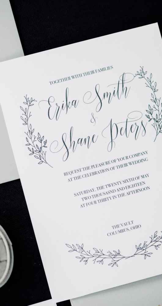
The gorgeous stationery suite featured hand-drawn floral arrangement details paired with a light gray envelope. A gold seal matched the gold elements on the table.
Layers of white chocolate mud cake and raspberry Swiss meringue buttercream made up the decadent cake. It was also given a rustic, buttercream texture and accented with greens as a nod to the shoot’s different textures.


are you a bride-to-be?
We'd love to plan with you on weddingday-online.com. Let's get started!
are you a wedding extraordinaire?
Join WeddingDay Magazine in inspiring brides by partnering with us! See how here.



Join the conversation
Log in or register to post comments