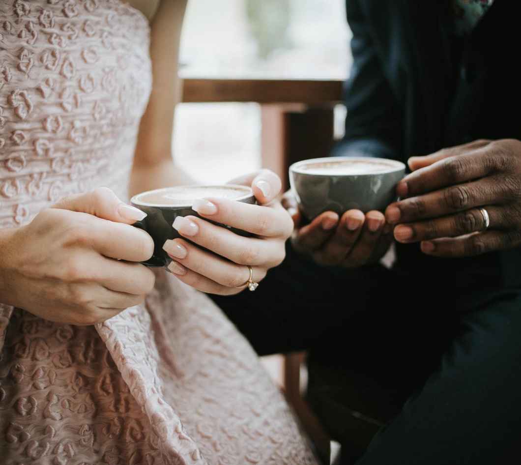
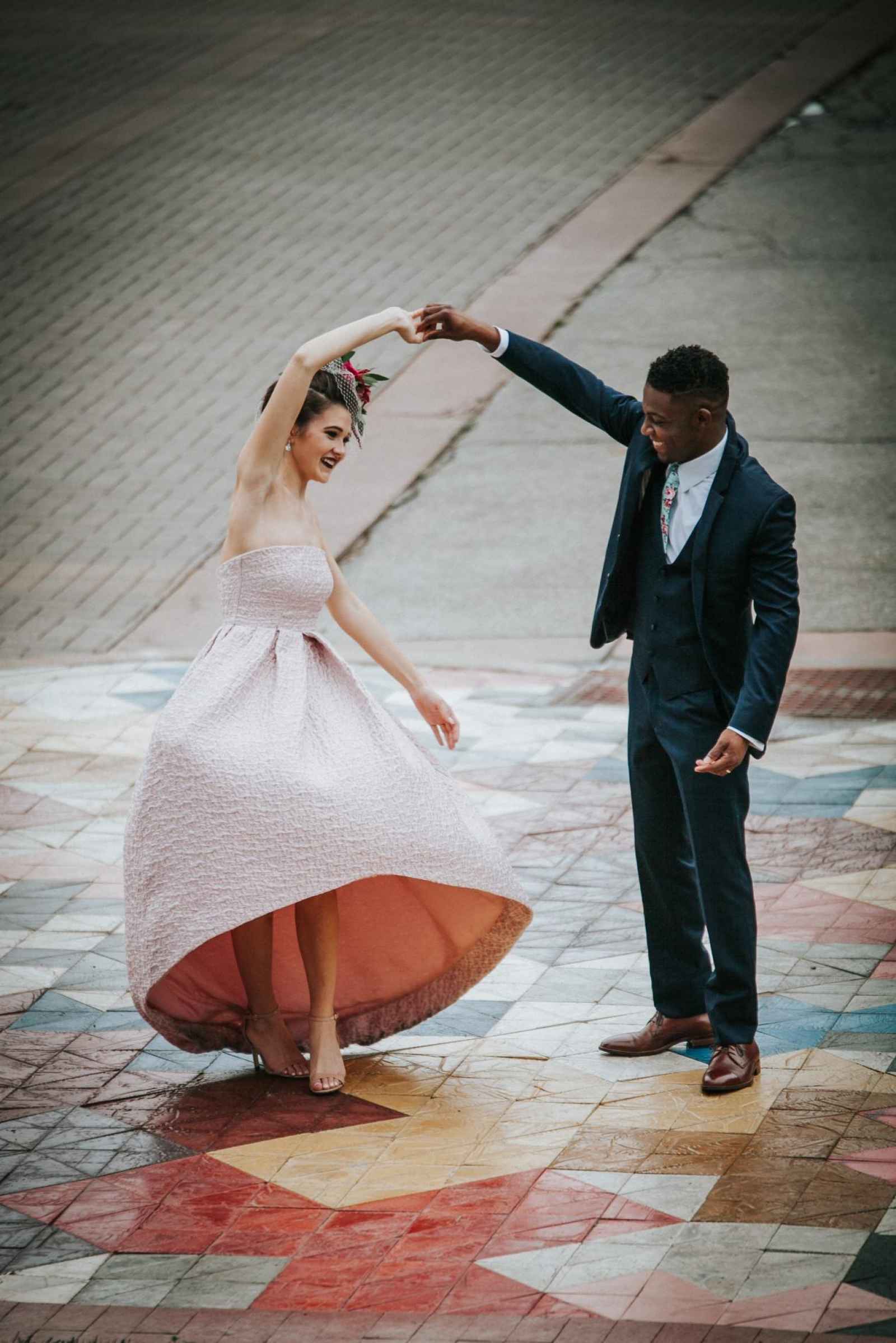
Ashleigh Fisher of AFW Events had her heart set on celebrating her love for Columbus’ architectural history and its community with a style shoot. She says, “I’ve always been happy to share my passion for local food, architecture, and coffee and wanted to bring these favorite things together. This team created a special day where instead of the art being a nice background for a bride and groom, the couple would instead become an extension of the art.”


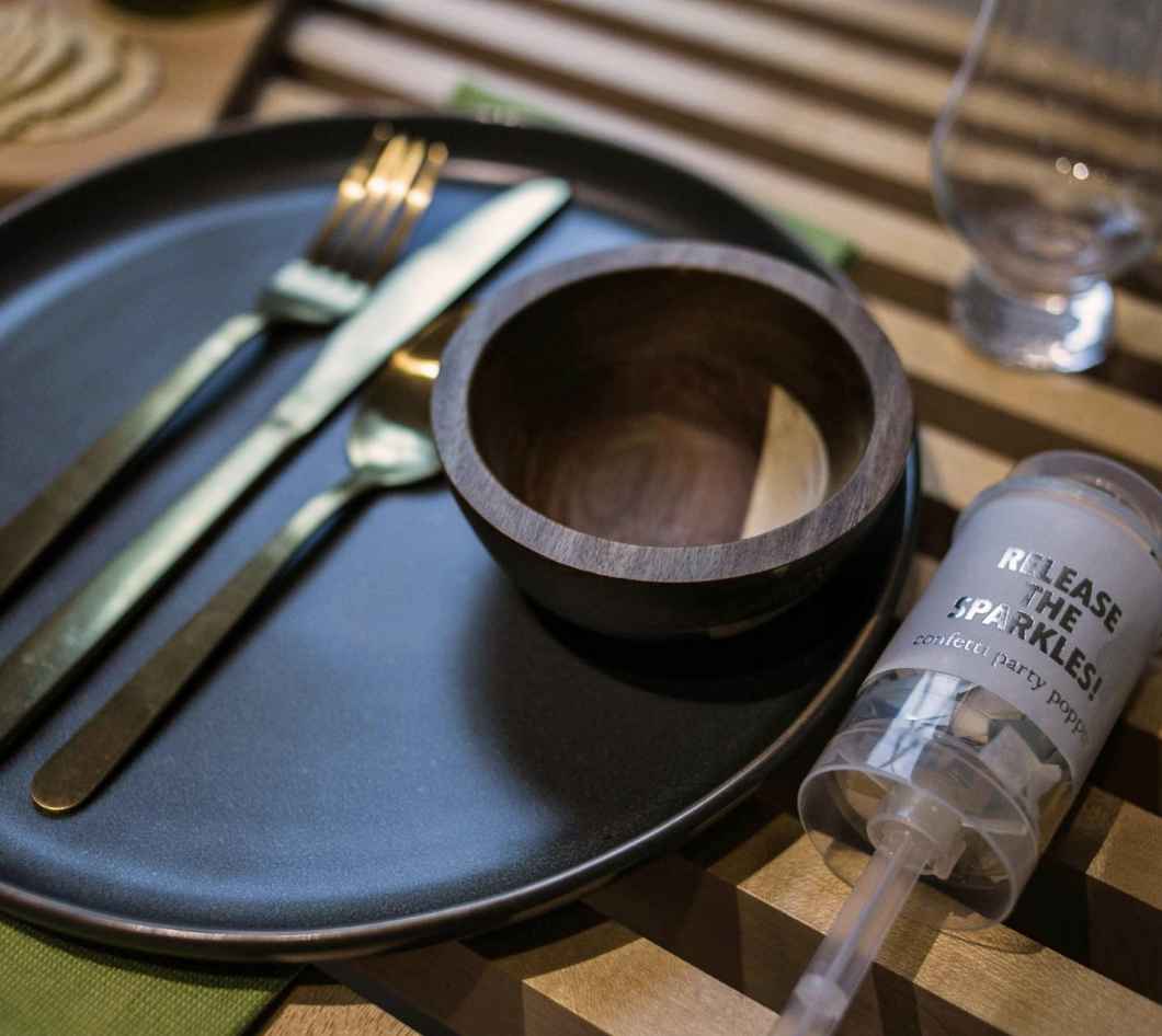
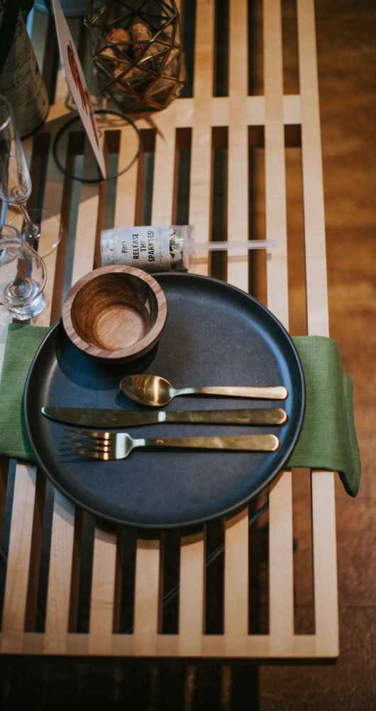

And the power in portraying this vision was in the hands of each participant who came to the project with a passion to do something different. Ashleigh explains, “This styled shoot was not going to be just a blend of local wedding professionals showcasing their individual talents. This collaboration would combine my vision along with the individual skills of each vendor, resulting in a unique and bold shoot that captured Columbus and the couple perfectly. We could not have imagined that this collaboration would end up as amazing as it did! Each vendor put their heart and soul into this event. We are so excited to share this beautiful styled shoot and can't wait to see how it inspires other wedding professionals and brides to consider doing something bold, fun and edgy!”
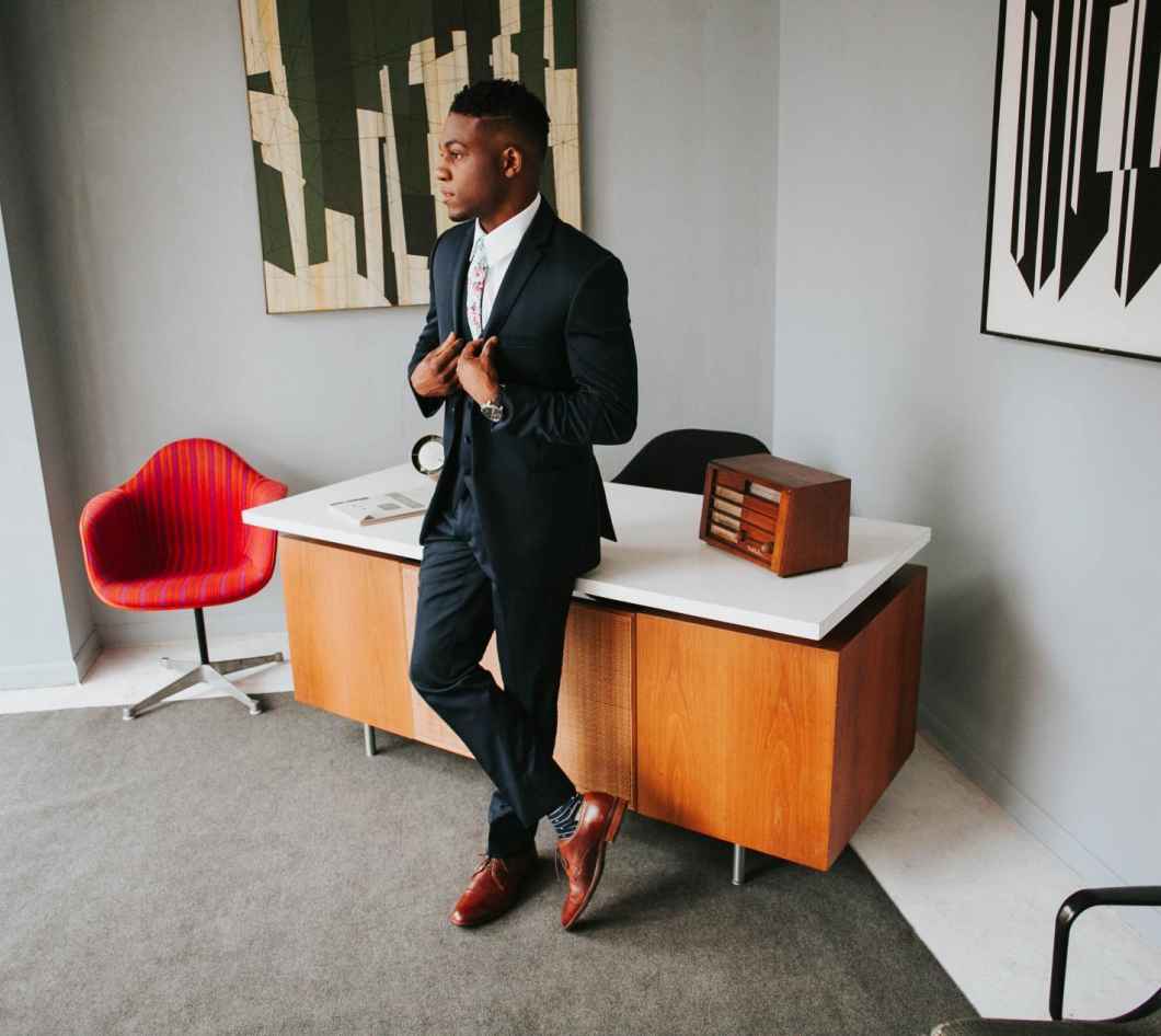
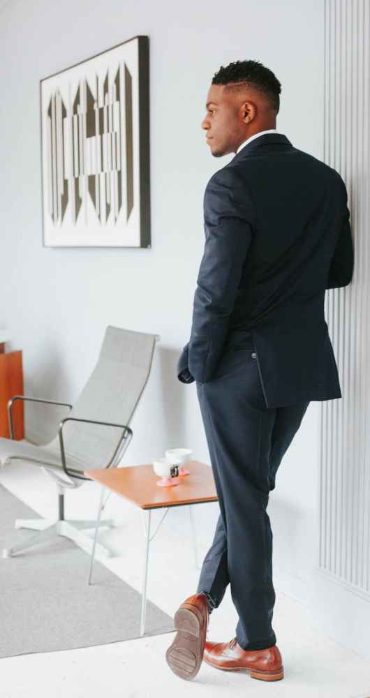



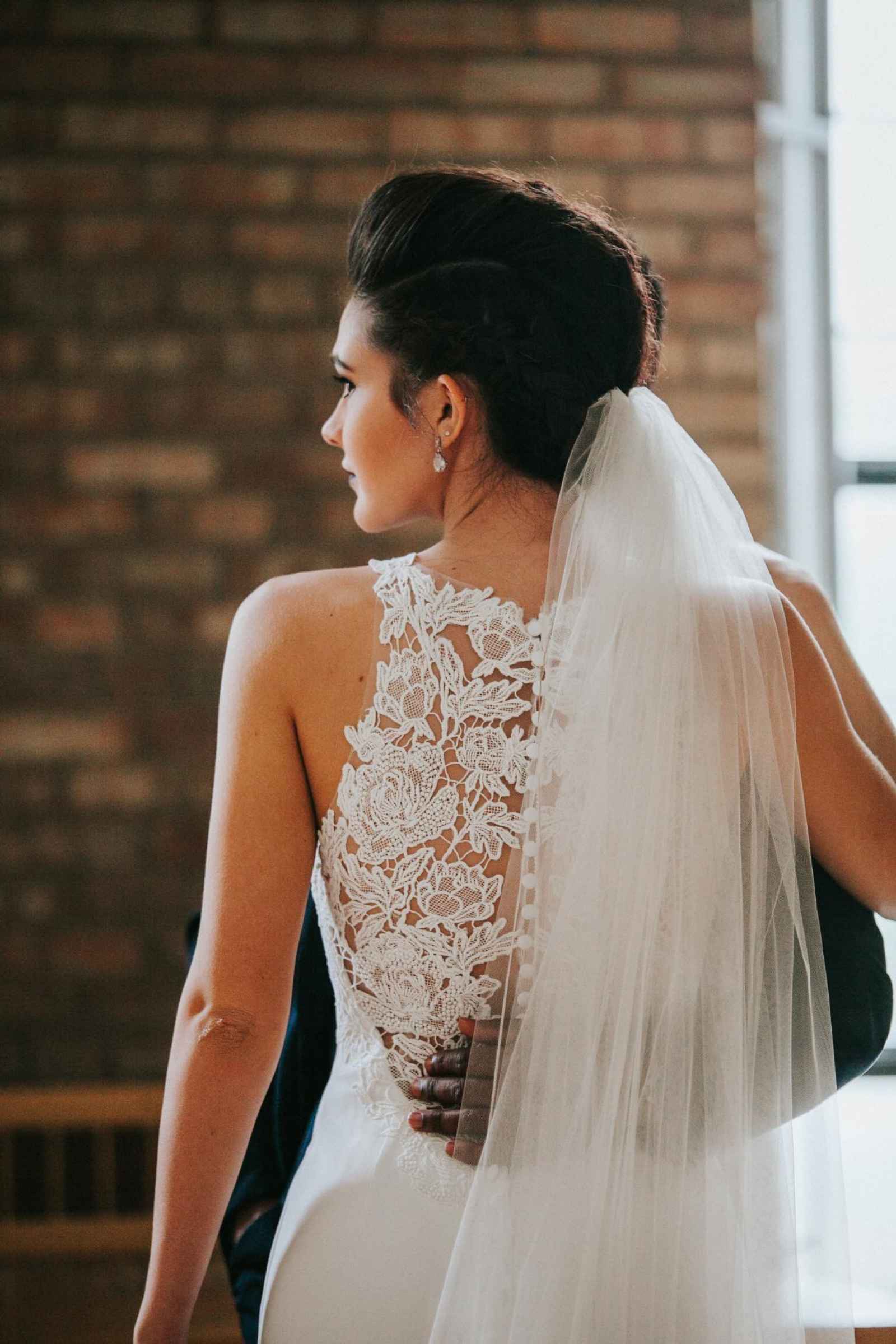
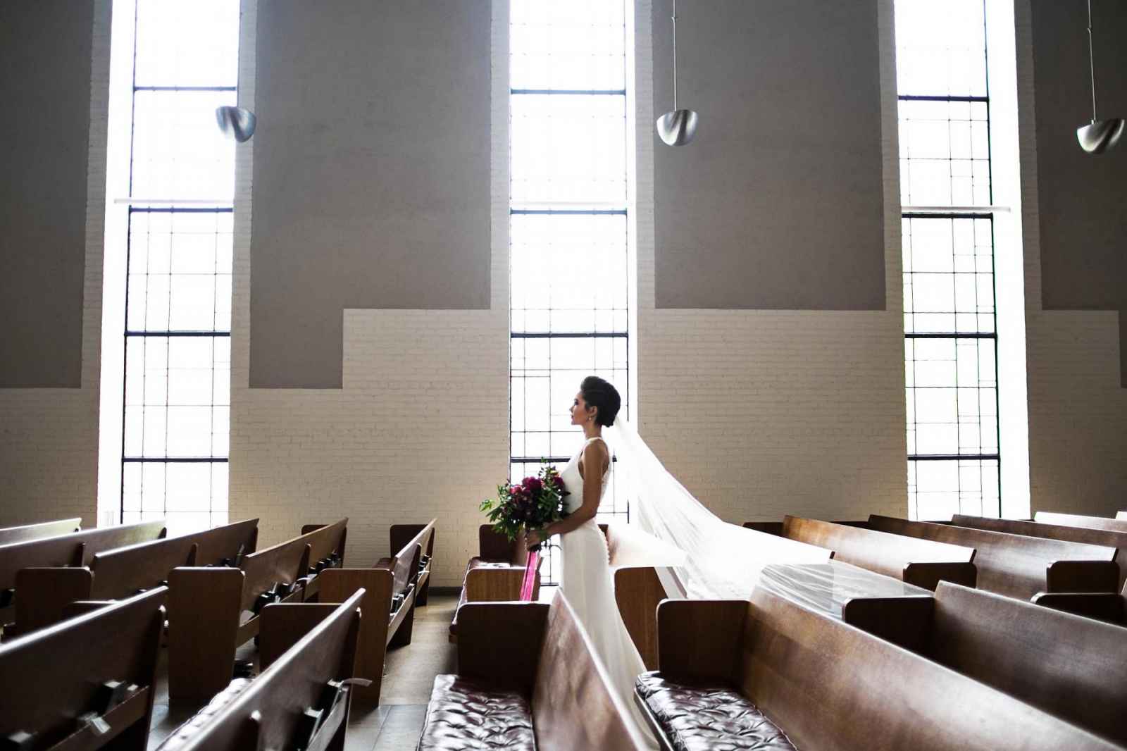
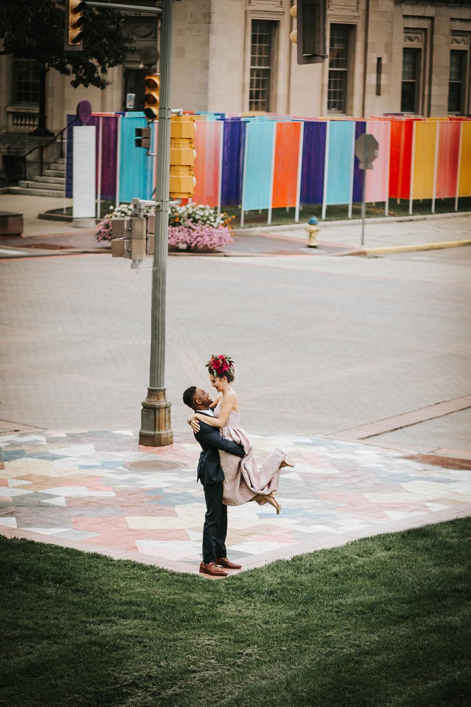
“First Christian Church, the Cleo Rogers Memorial Library, and the art of Exhibit Columbus (an annual exploration of architecture, art, design, and community) served as a perfect backdrop to create the mood,” says Ashleigh. “These buildings and many more have made Columbus a mecca for contemporary architecture and design. With Exhibit Columbus going on, I didn’t want to miss the once in a lifetime opportunity to capture something unique.”
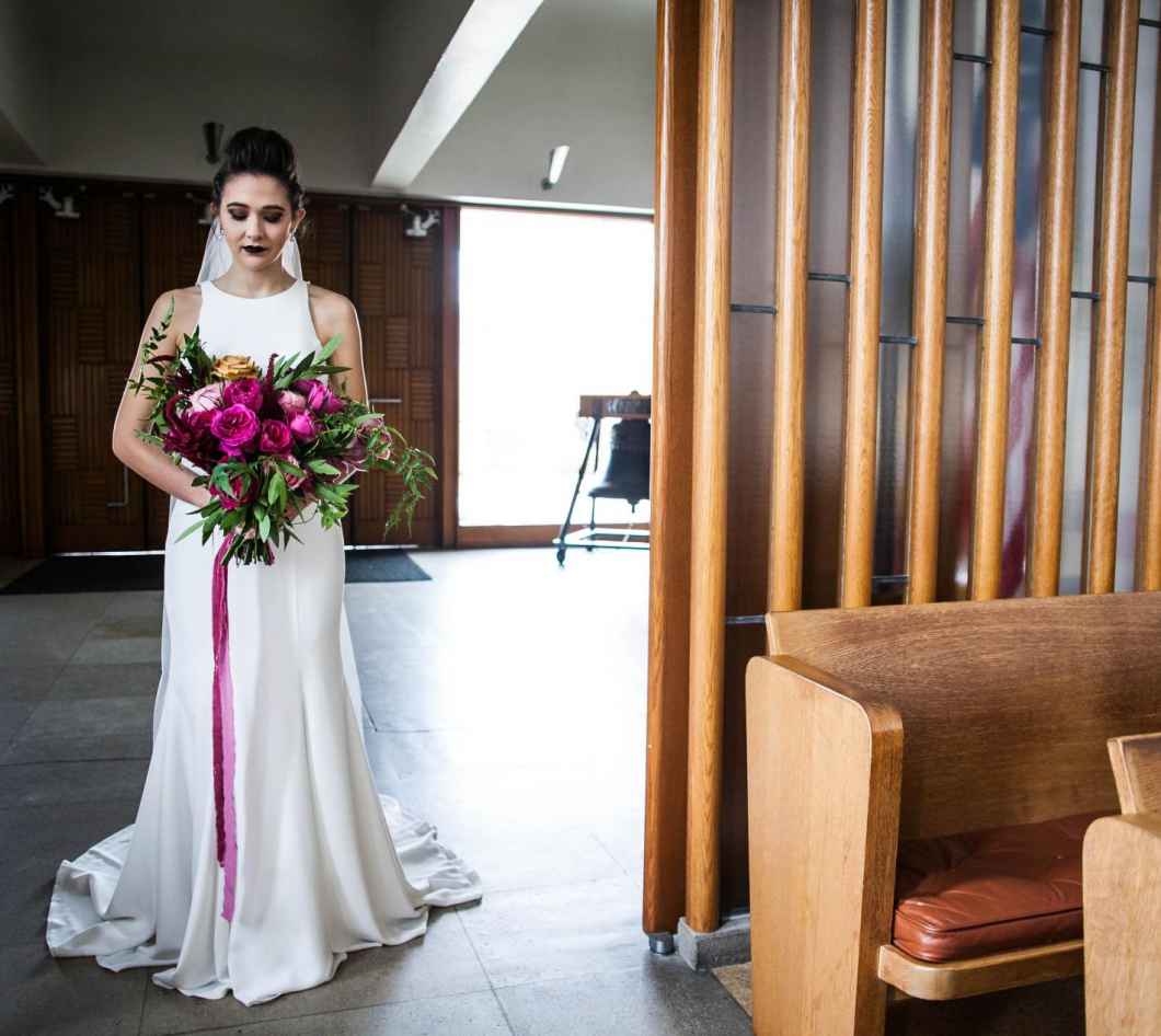
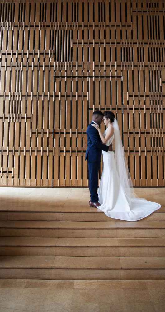

Ashleigh says, “I chose two photographers for this venture, because I wanted to make sure there were different views of everything. Art is very subjective for individuals so capturing it in more than one way was important. Sarah and Marinda shoot very strong traditional photography but have a complementing style.”
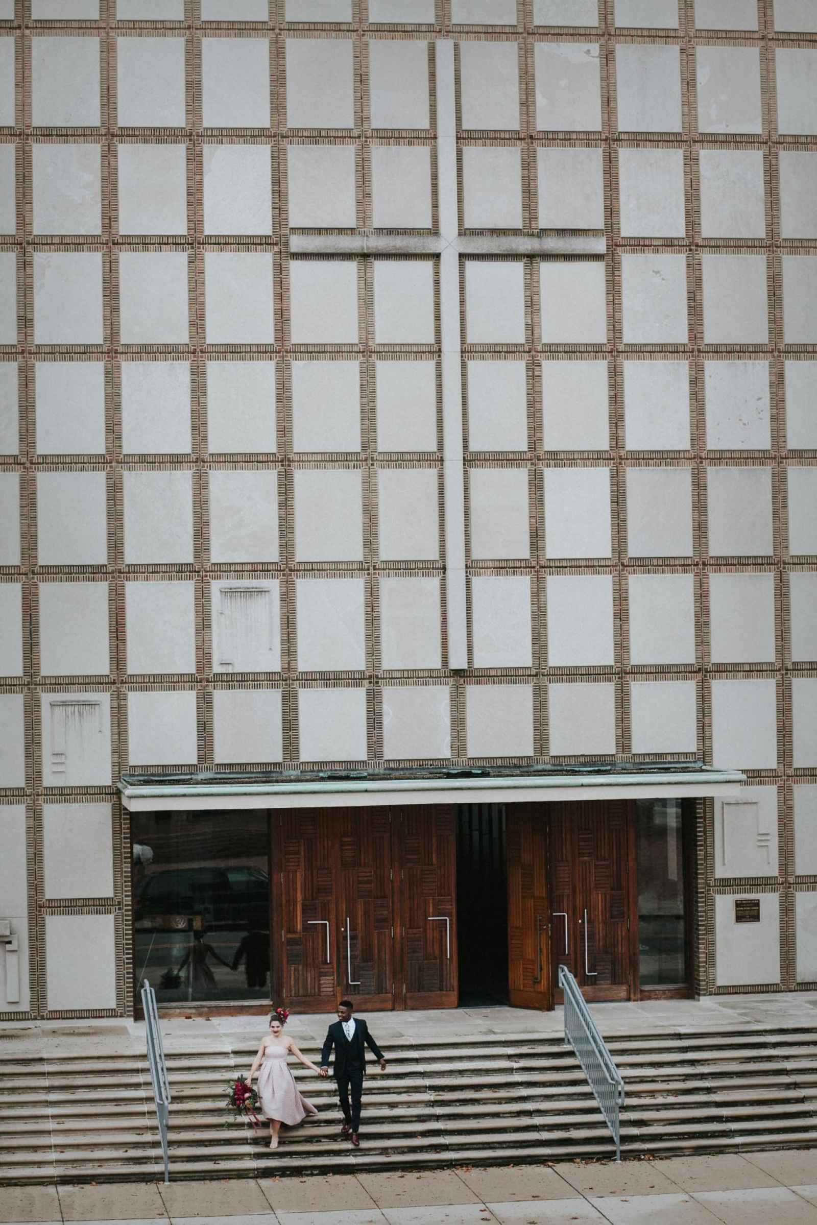
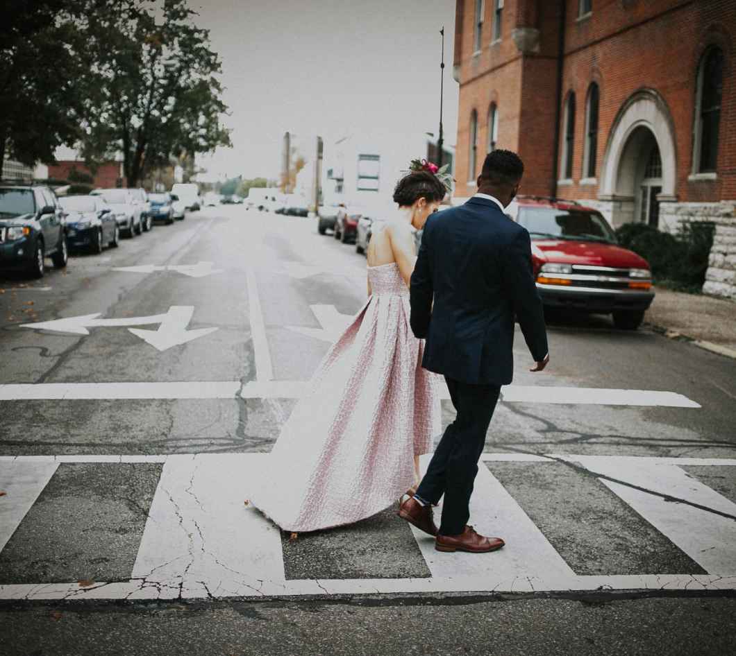


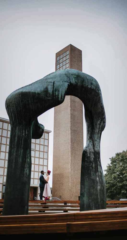
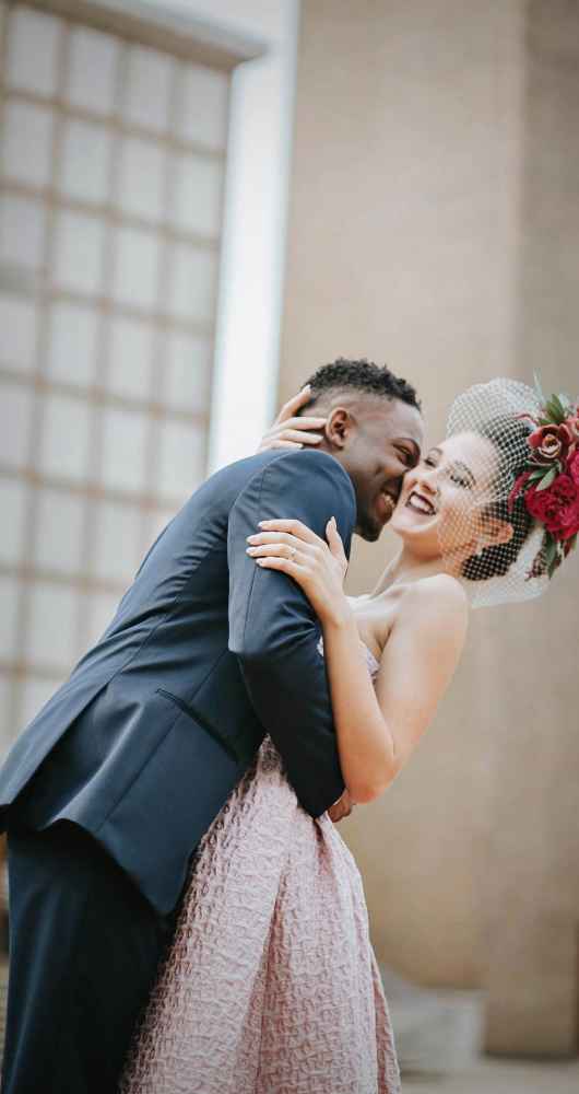
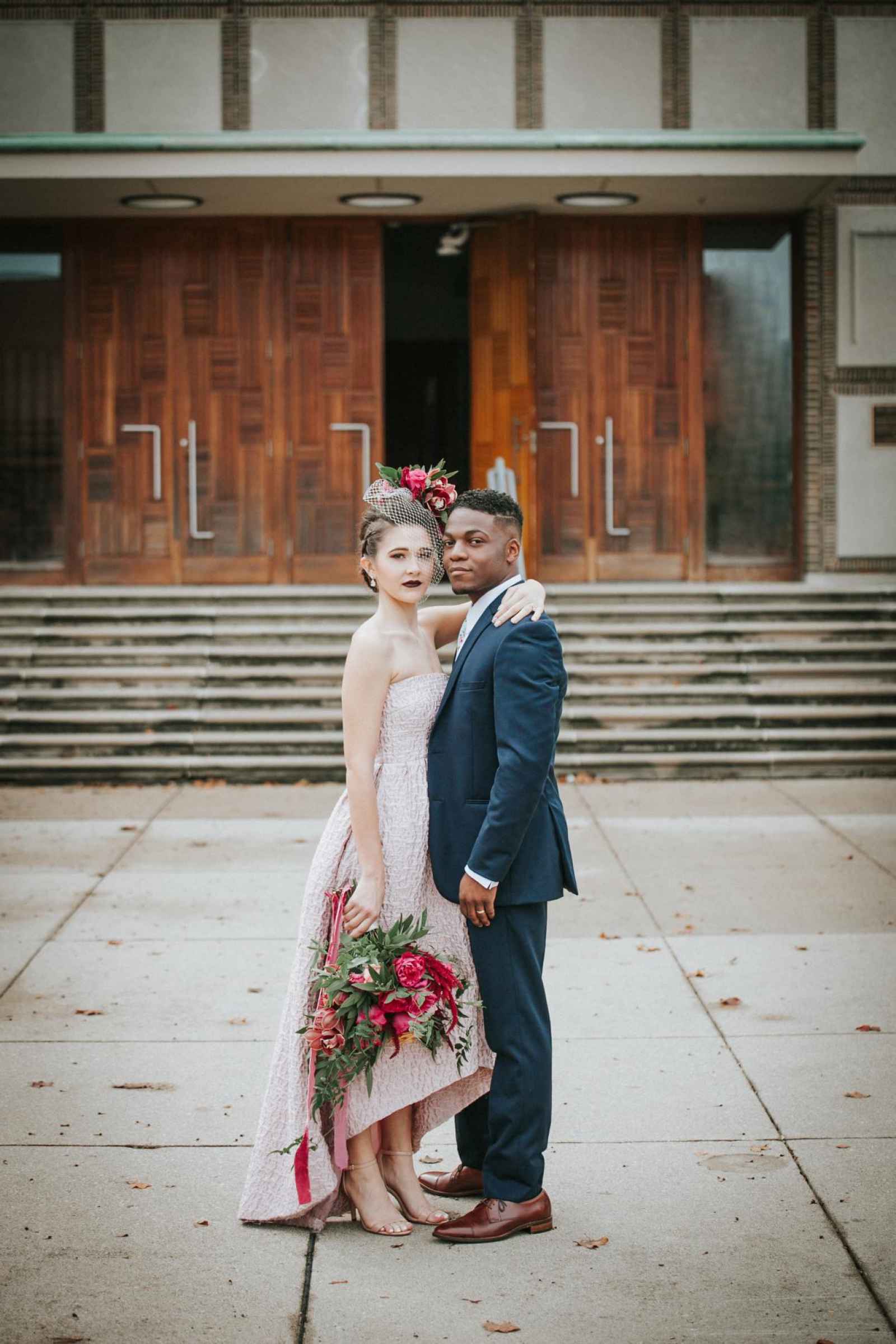
“Columbus is famous for contemporary buildings, so I really wanted to capture the monolithic lines that break the skyline of the flat Midwest prairie surrounding this city,” Ashleigh says. “Everywhere you look, sleek lines lead you down the street or draw your eyes up to the sky.”
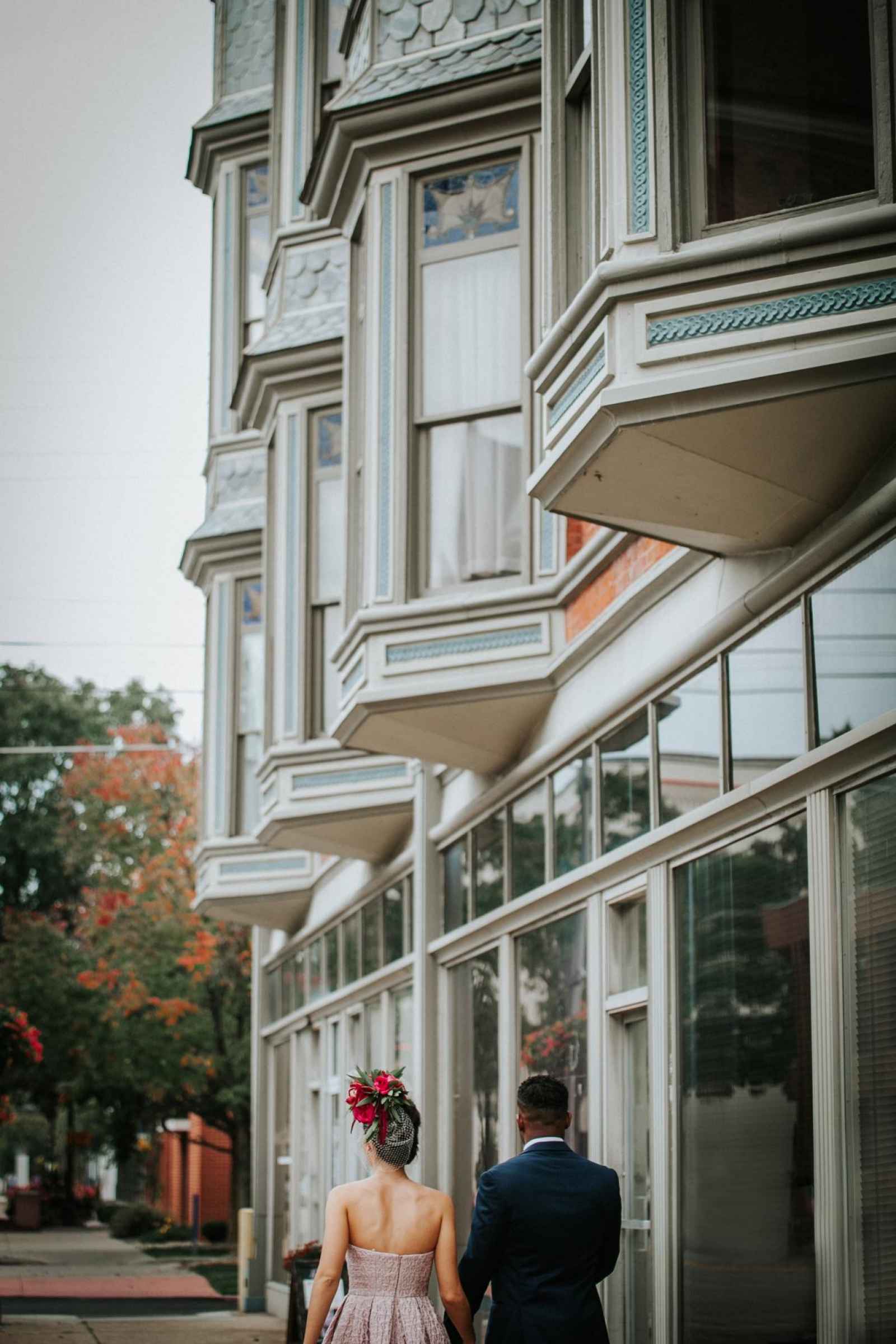

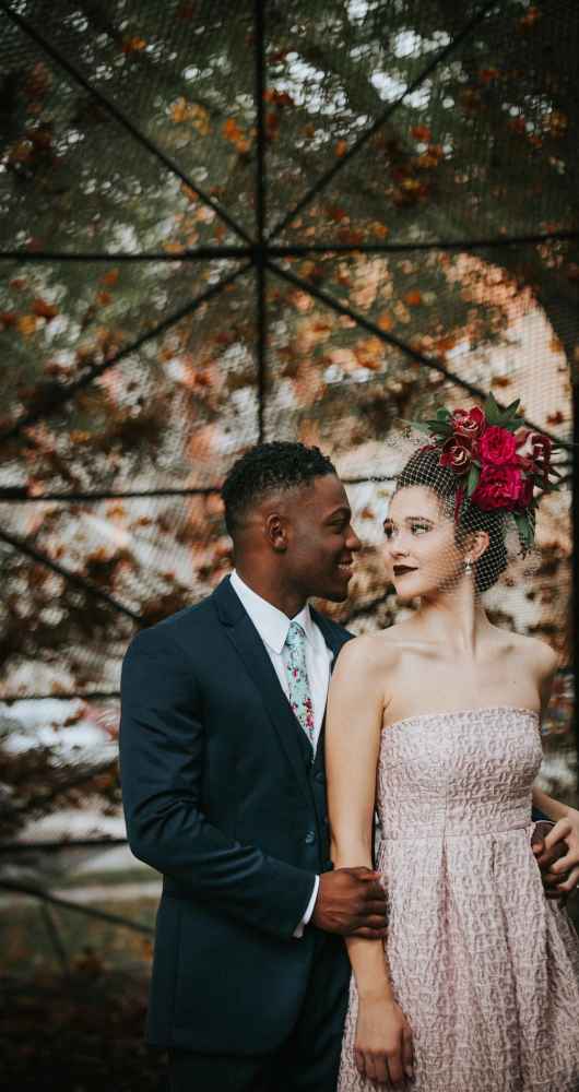
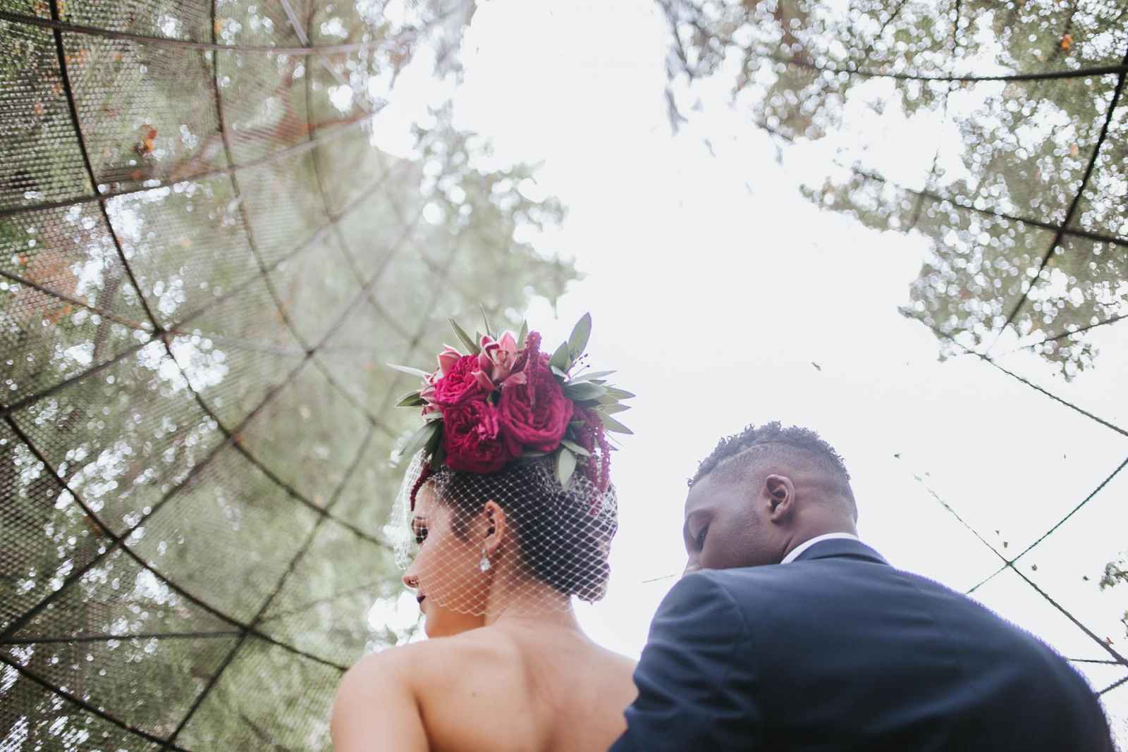

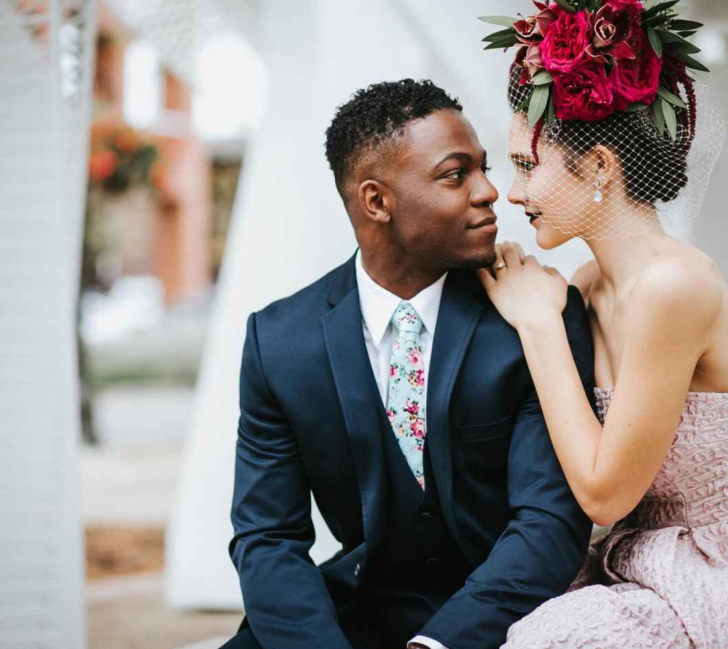
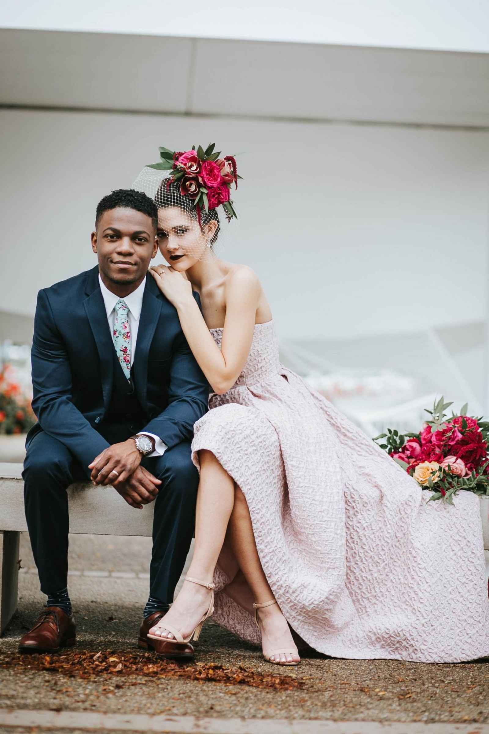
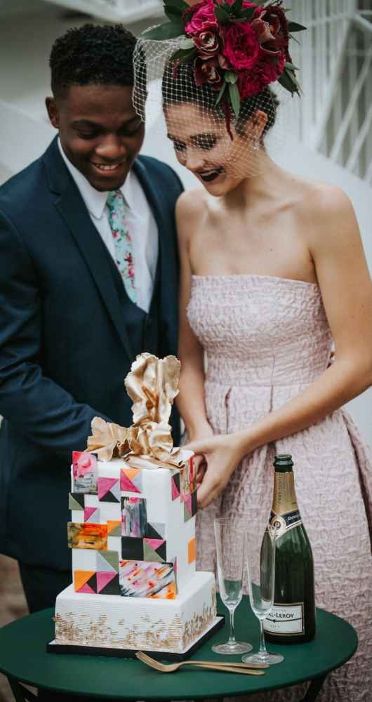
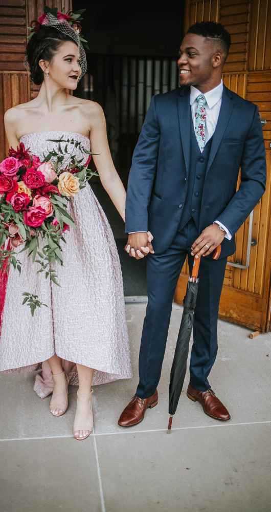
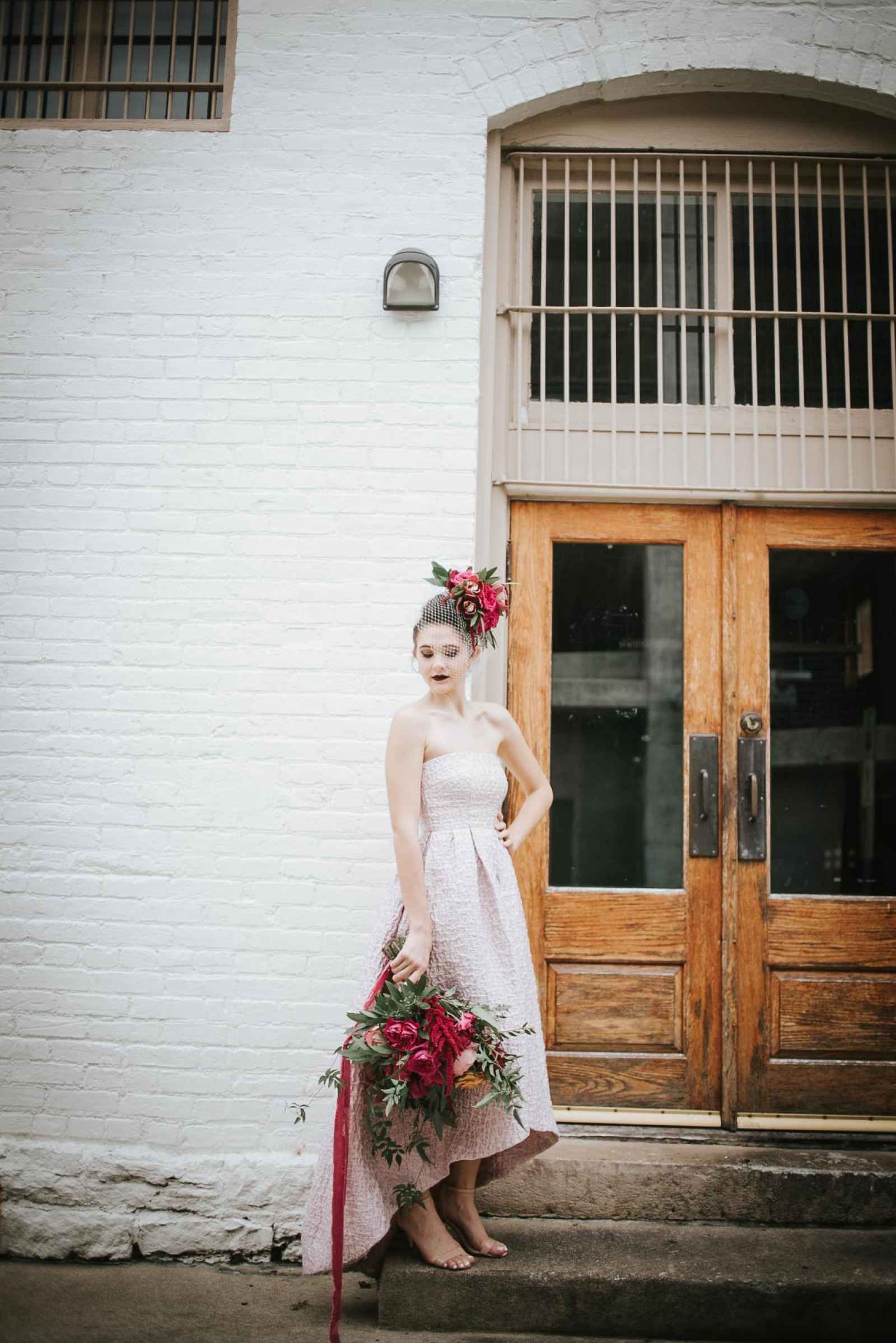
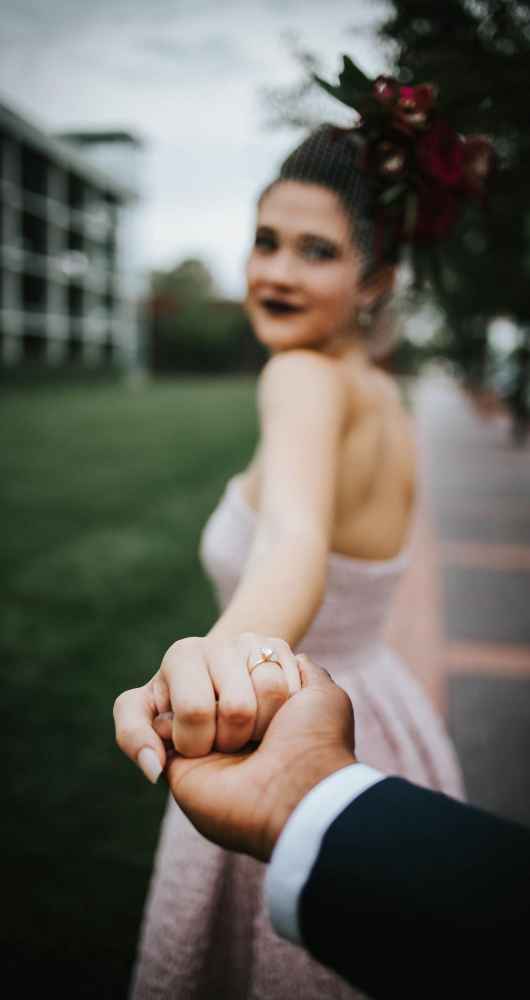
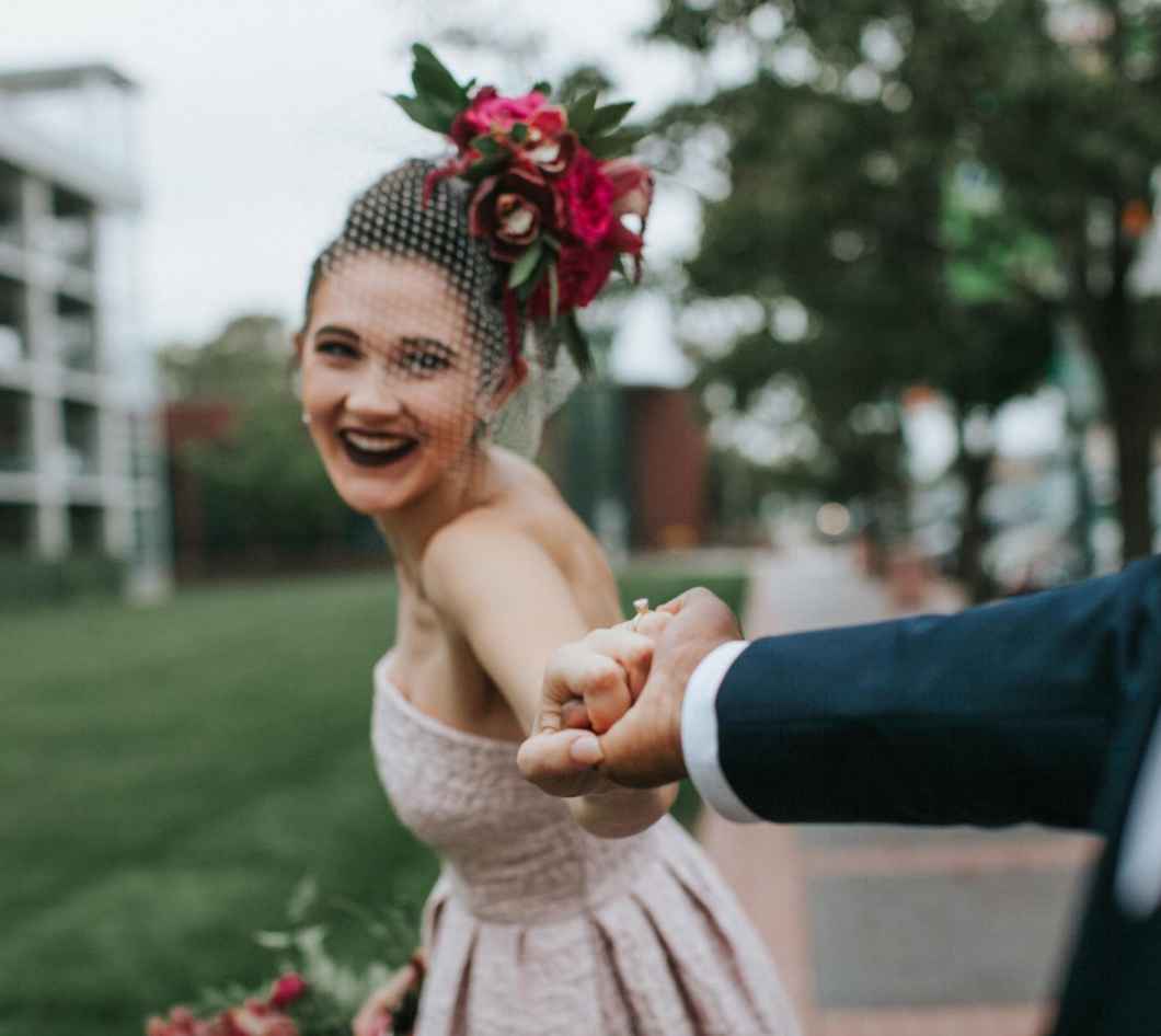
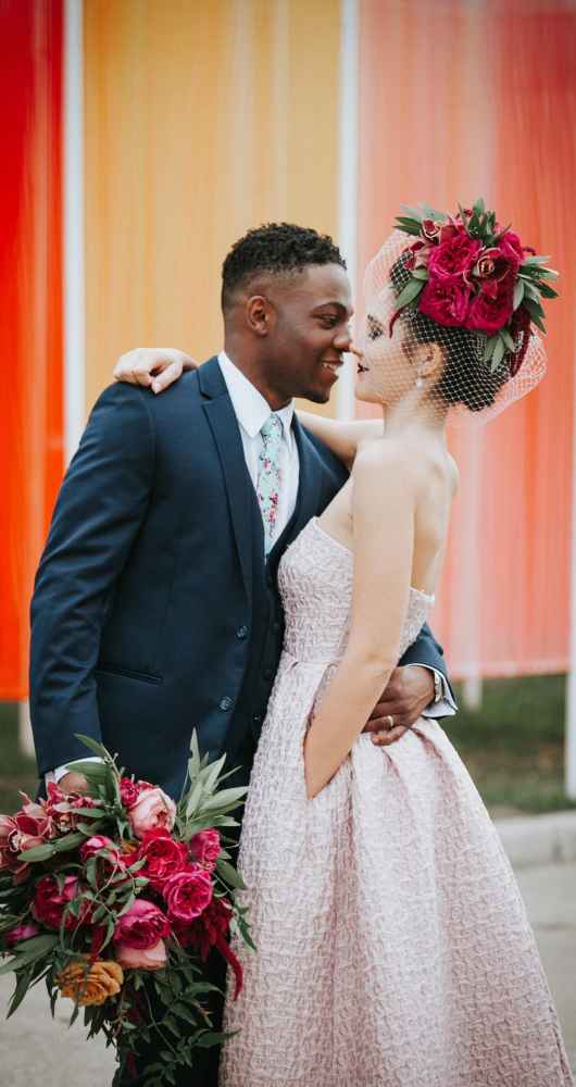
Simple and strong were the magical ingredients the team was looking for to create their modern look. “That Special Touch found us an Allure Bridal dress with clean lines and a killer lace back,” says Ashleigh. “We also found a dusty rose, leopard, high-low gown by Cynthia Rowley. I couldn’t choose one over the other, so with the support of the team, we chose both.” Bree and Lindsey from Blondies Tan & Spa created a hair and makeup look that was dark and edgy to play opposites with the lighter colors of the art. The result was a blown out faux-hawk and deep, red lips.
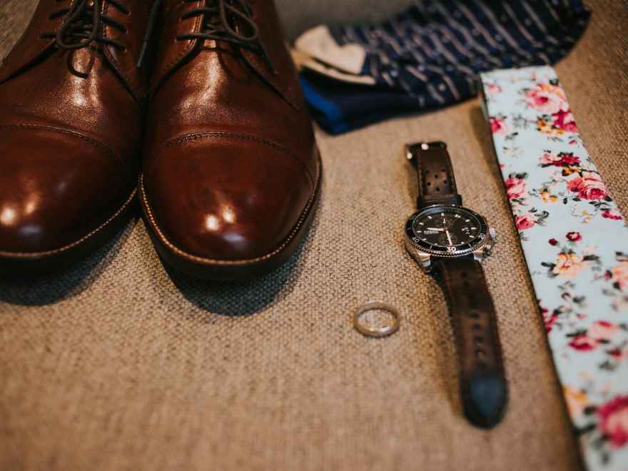
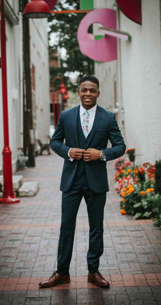
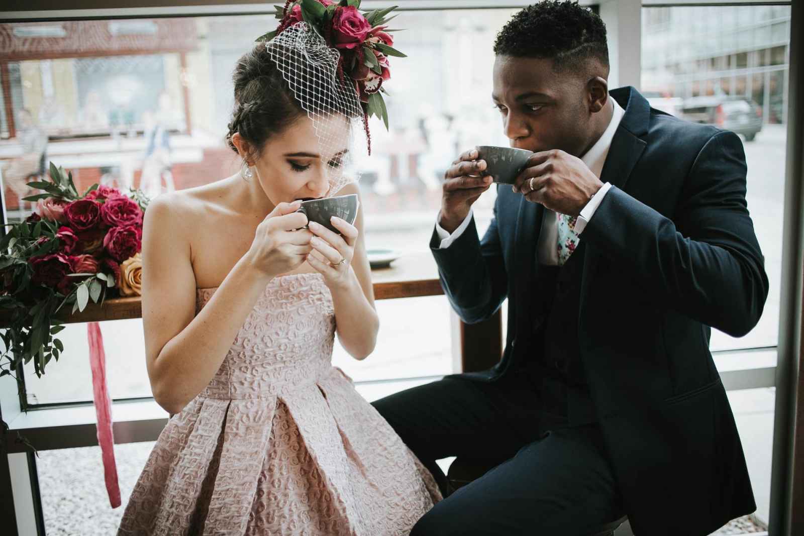
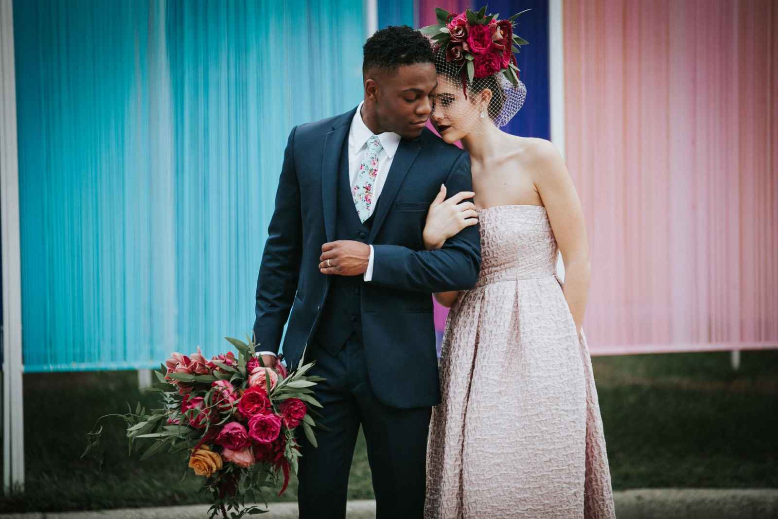
The groom’s handsome look was completed with a dark blue ultra slim Jim’s Formal Wear by Michael Kors ensemble and a floral tie by Ty’s Ties.



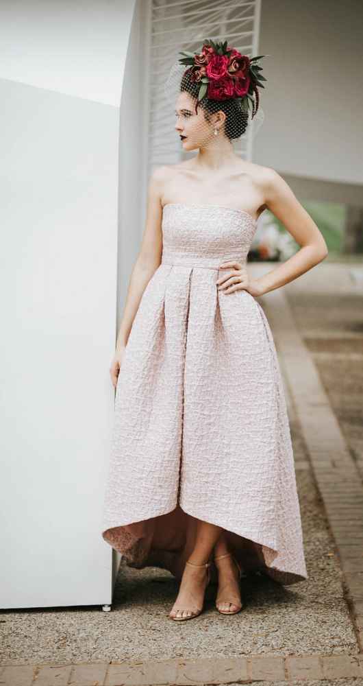
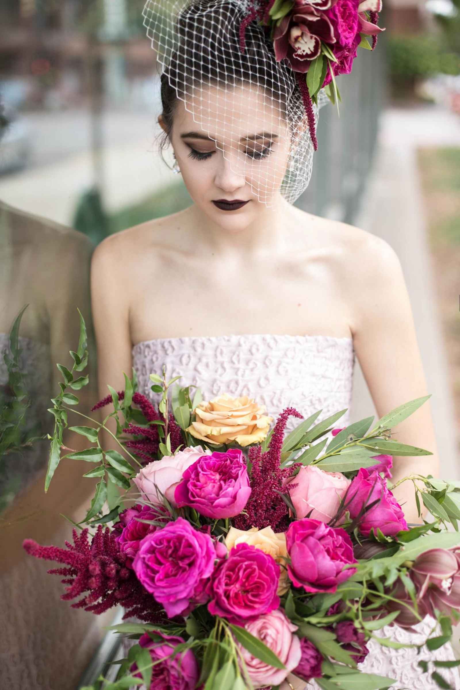
Ashleigh says, “Pomp & Bloom created a flowing traditional bouquet with bold, fuchsia roses and eucalyptus, softened with light pinks and yellows. However, the unique piece Gina created was a flower headpiece to be worn with the rose-colored gown. Gina focused on the brightest colors in our palette and paired fuchsia roses and burgundy orchids with a birdcage veil. The headpiece was such a fun way to get that bold and edgy look we wanted for the bride and really made a sharp contrast against all the contemporary buildings.”
And as for the gorgeous color palette? “The overall color inspiration came from renowned designer Alexander Girard,” Ashleigh says. “He was an integral part of Columbus design in the 1950’s. We found a print that he had created with a very bold combination of reds, pinks and yellows. We all played on that color theme and formed the motif for everything we did incorporating it into the cake, flowers and invitations.”


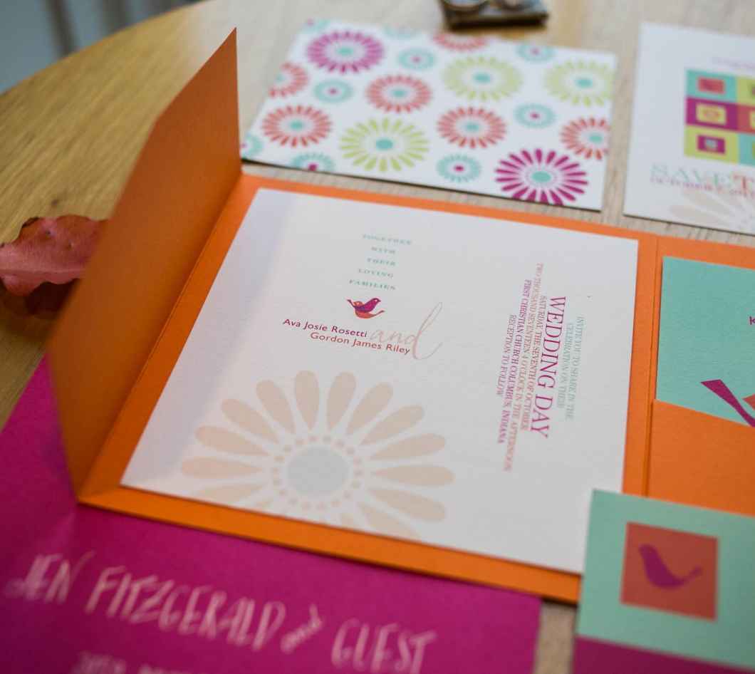
The stationery, created by Tammy Apple Design, was inspired by the gridwork design of the buildings they shot in, featuring whimsical Alexander Girard doves and a color scheme of fuchsia, orange, blue and green. “Faulkenberg Printing Company letter-pressed the design and we finished off with calligraphy from Tangled Pen,” says Ashleigh.

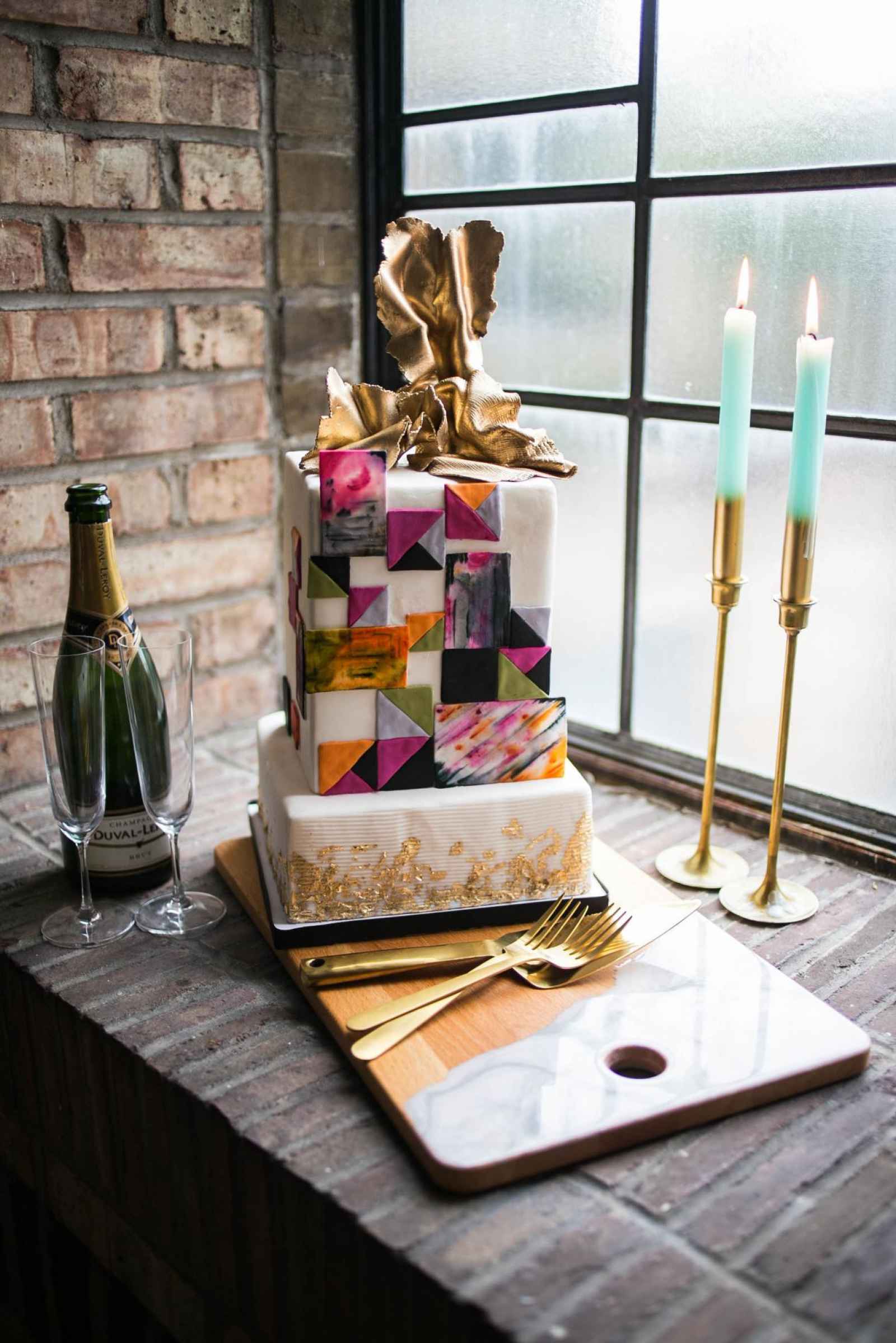
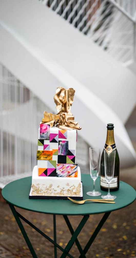
“Icing on the Cake by Kristina delivered a contemporary shape with an abstract element that I haven’t seen before,” says Ashleigh. “She skipped the traditional flowers and went for a patchwork of colors inspired by the Cody Hoyt installation, Theoretical Foyer, on Washington Street and a gold, free-style topper.”


are you a bride-to-be?
We'd love to plan with you on weddingday-online.com. Let's get started!
are you a wedding extraordinaire?
Join WeddingDay Magazine in inspiring brides by partnering with us! See how here.



Join the conversation
Log in or register to post comments