What do you do when you reside in an urban industrial center? In the case of this style shoot, the team knew they would miss a perfect opportunity if they didn’t embrace the industrial theme and really showcase the beauty of their locale. Miranda Crace, the designer and founder behind Spoke Event, a Detroit-based event planning company says, “Erin originally came to me with the idea of an edgy and minimal styled shoot and I loved it. We collaborated on the design proposal and wanted to create something that was beautiful and soft—but had rough edges.”


“I think it speaks to our city too,” says Miranda. “Detroit has so much beauty and creativity bursting from it, and we're lucky enough to work here and be a part of that. It's inspiring and motivating, but being an industrial city, there are these rough edges. These factories and warehouses. Erin of Erin Hannum Photography certainly captured this beautifully tattered essence in front of the lens."
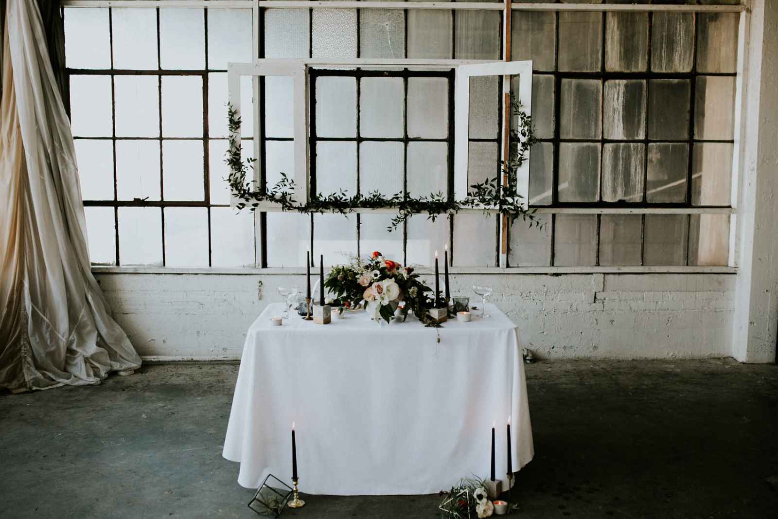
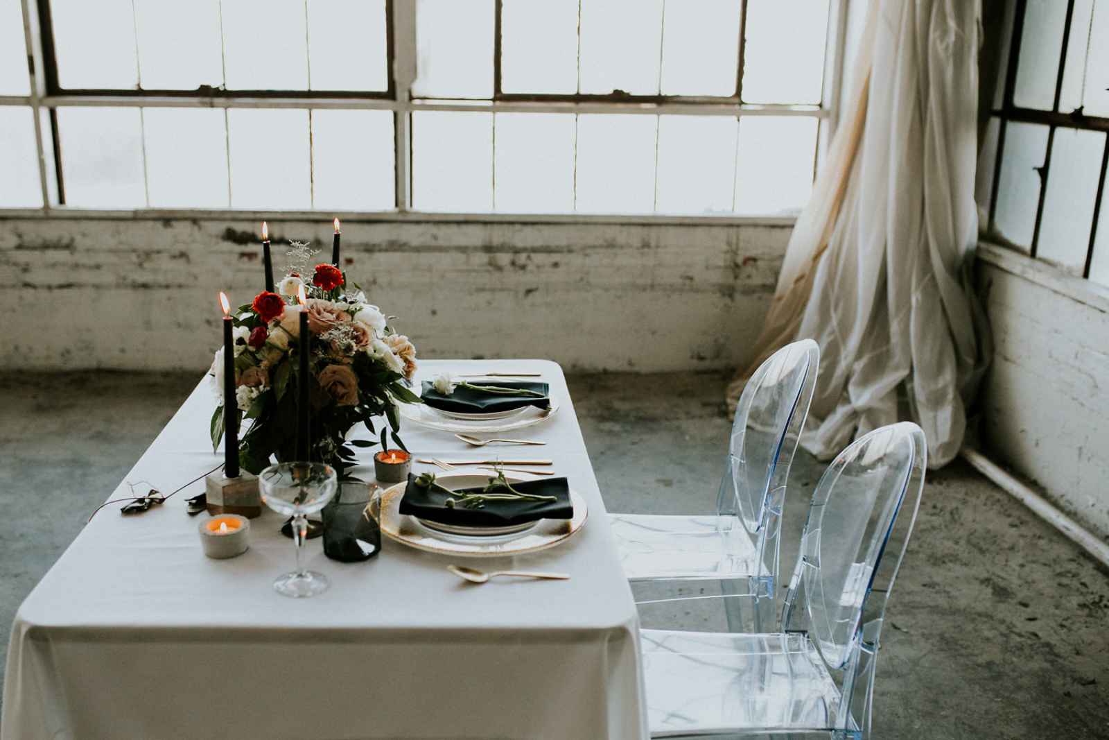
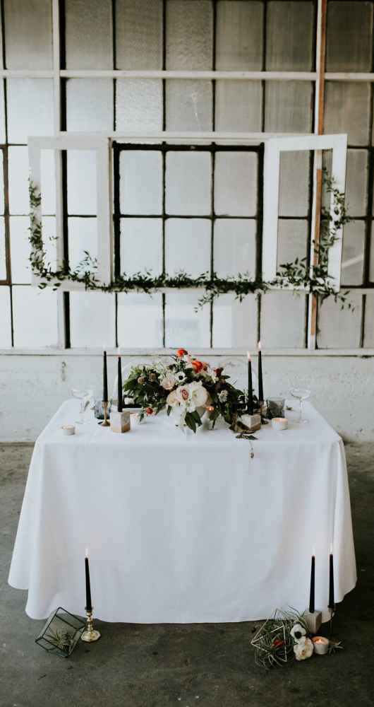
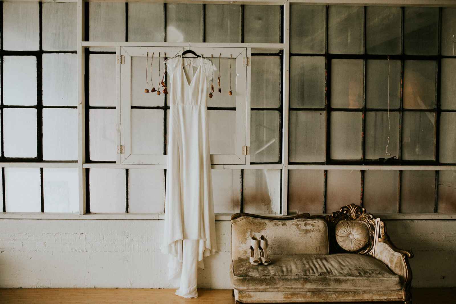
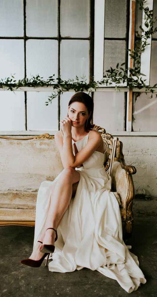
The team fell in love with Russell Industrial Center. Miranda explains, "It literally brought that rough, industrial feel of Detroit and mixed it with something soft and beautiful. I don't think it's what you'd expect, but neither is Detroit.” The venue's great aesthetic includes natural light, white space, concrete and industrial windows. White walls added the minimalist feel and allowed the bride, her dress, the cake and florals to shine—including the unique climbing greenery frame.
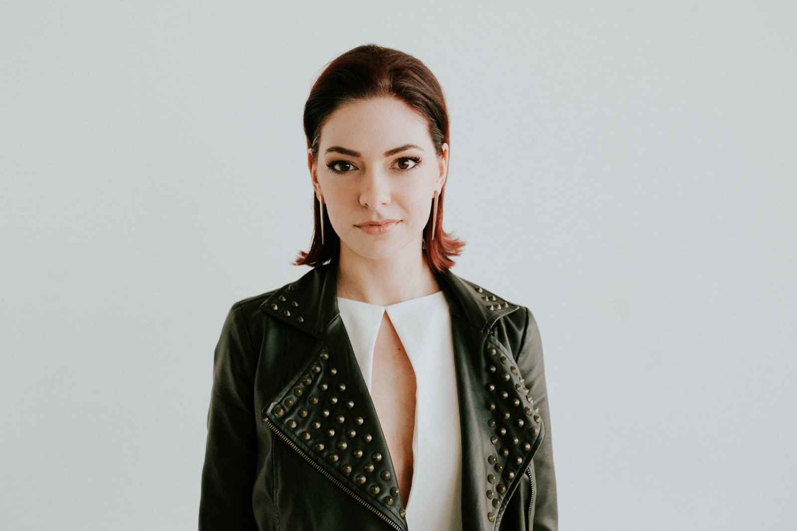
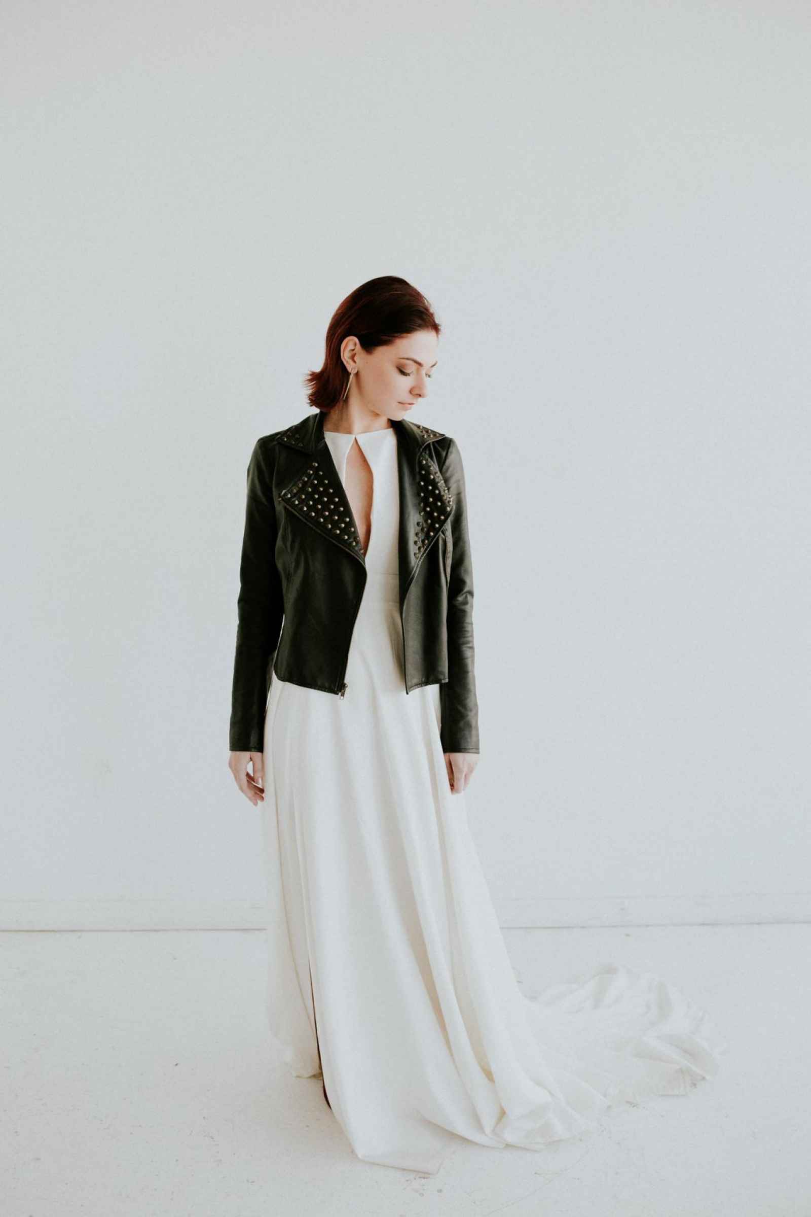
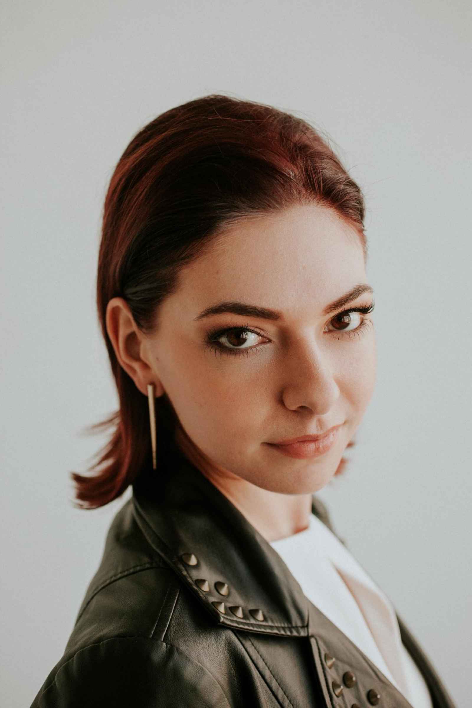
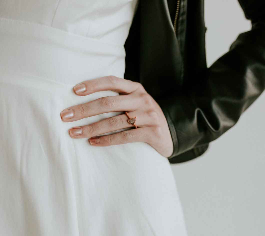
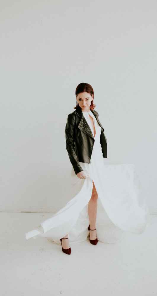
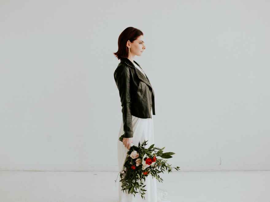

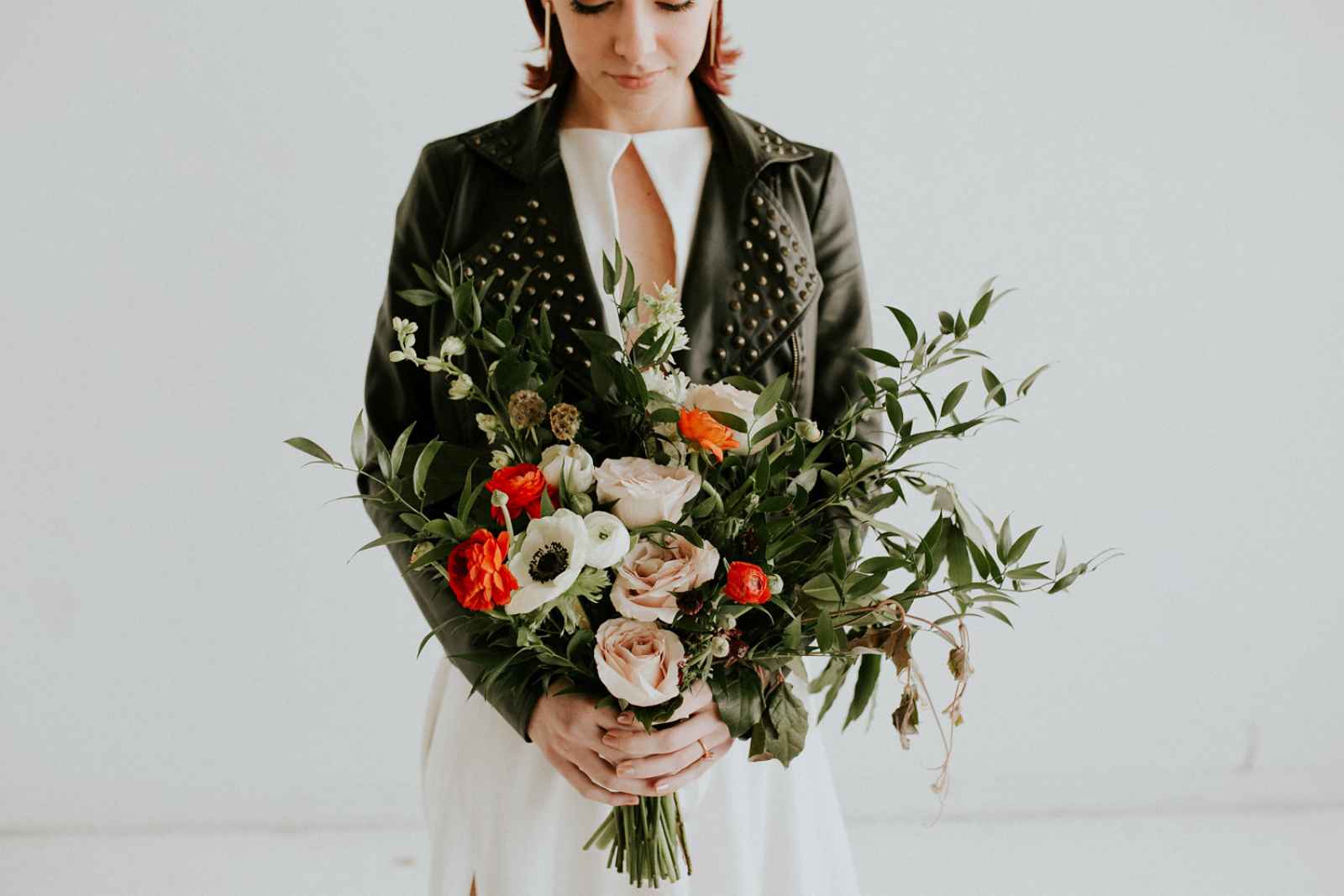
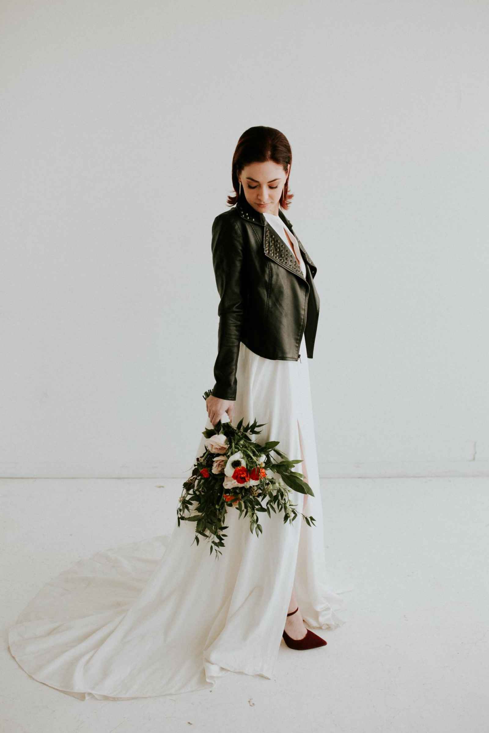
The simple, yet sexy design of the dress added the very edge the team sought. They knew it would pair well, especially, with a leather jacket. “Kristin at Detroit Bridal House has such a beautiful selection of dresses. We had showed her a design proposal for what we wanted to do and she pulled this dress to show us. It was perfect!” Miranda says.
Kyle Trombley of Kyle Ann Design aimed at highlighting the bride’s beautiful, natural features. She says, “I wanted to stay true to the minimalist vibe that the rest of the shoot had. Because our bride had amazing bone structure, I wanted to make sure that she looked like herself, so I did a soft, natural eye and lip, because her hair had a sleek, edgy look. I brought in a rose gold in the middle of a matte nude, light, smoky eye to bring out the honey tones in her eyes.” Brittany Ounanian gave the bride an effortless look by pulling her hair away from her face, allowing her beautiful features to shine.

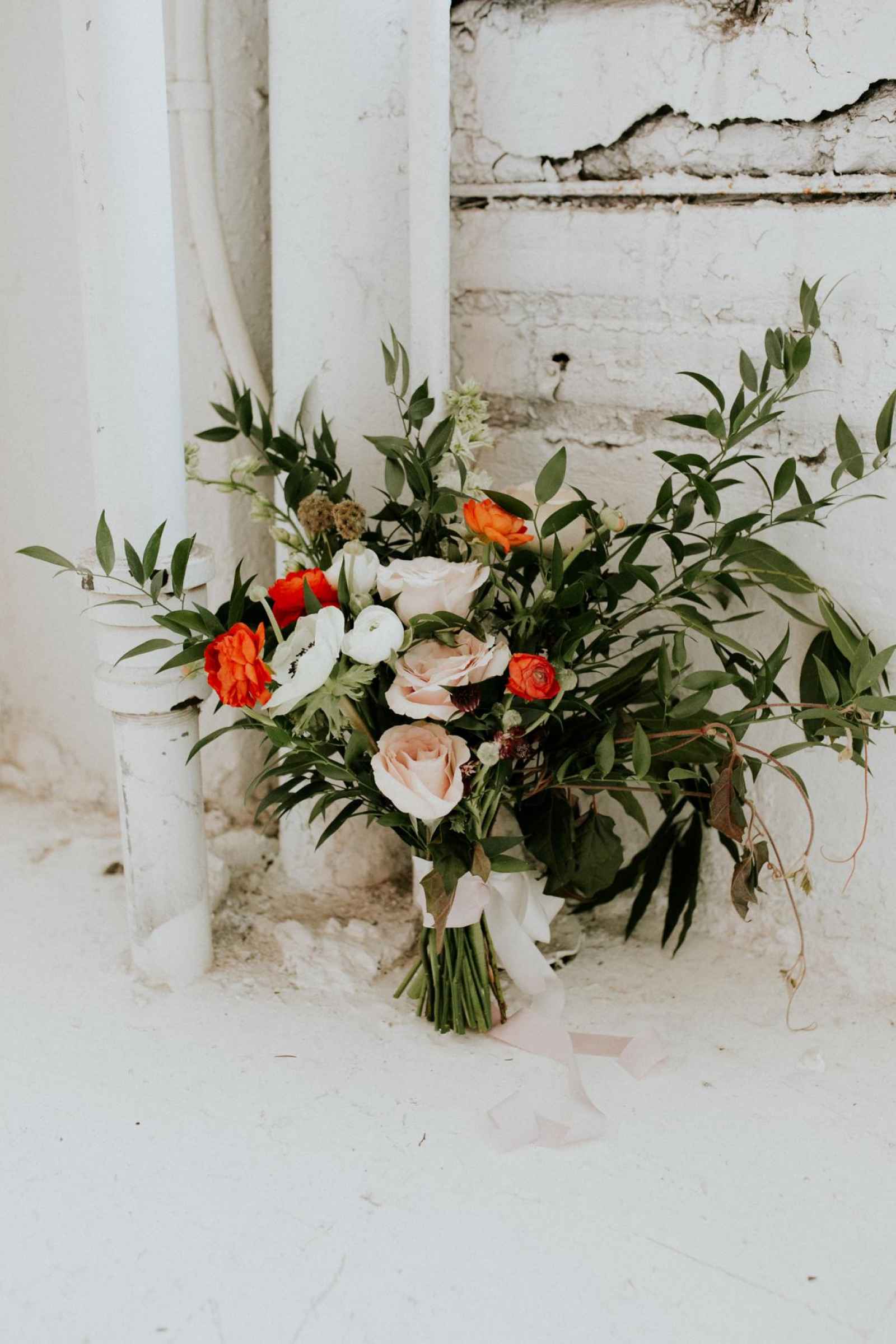
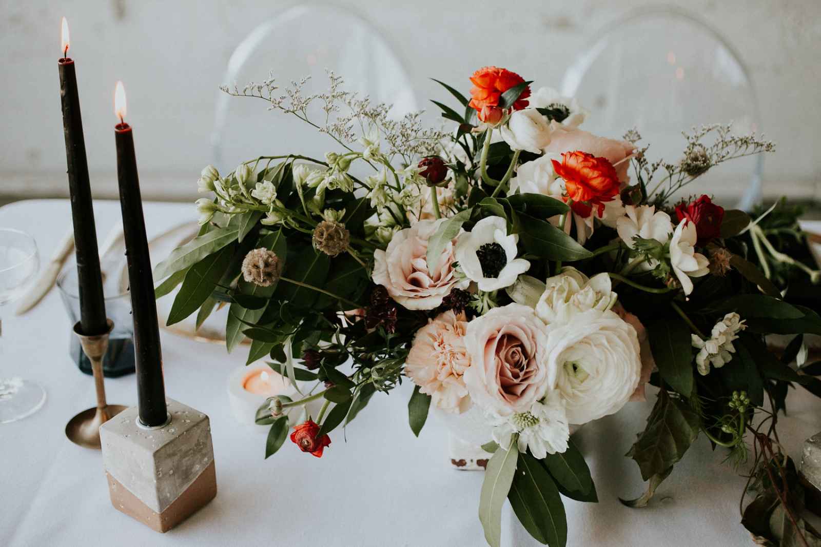
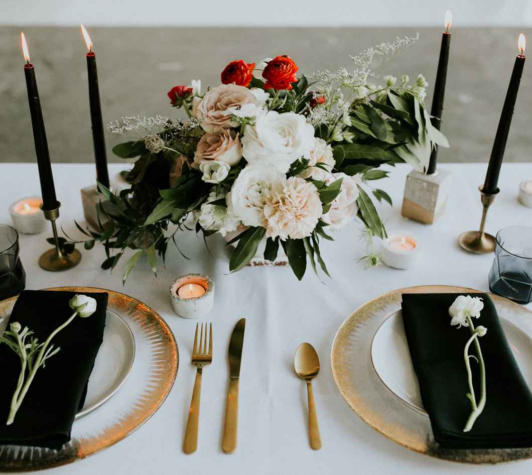
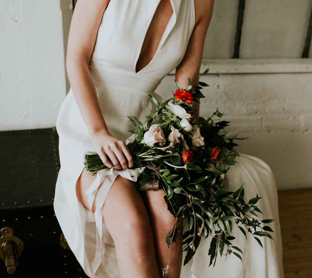
Fatima Bazzi of Sudio Terrain provided the magic behind the florals. Using Italian Ruscus, bay laurel, grape ivy, ranunculus, Scabiosa pod, larkspur, anemone and Quicksand Rose, Fatima crafted floral designs that would complement the shoot’s minimalist vibes. “To nicely complement the model’s leather jacket and fierce dress, the bouquet just had to have some untamed edges, a few pops of color and moments of delicacy in between,” she says.“With large glass panels and a bare window in the background, we knew there just needed to be a natural touch added somewhere.” The result? An Italian Ruscus-wrapped window frame, focal blooms and air plants.
When it came to the palette, muted was the name of the game. “With the space’s industrial yet bare and minimal feel, we felt it best to stick to a muted color palette," says Fatima. For the florals, these colors included the greens, browns, some off-whites, soft peaches and blushes and hints of black. "The one color we decided to incorporate that was not on the palette was the pop of orange showcased in the bouquet and centerpiece."
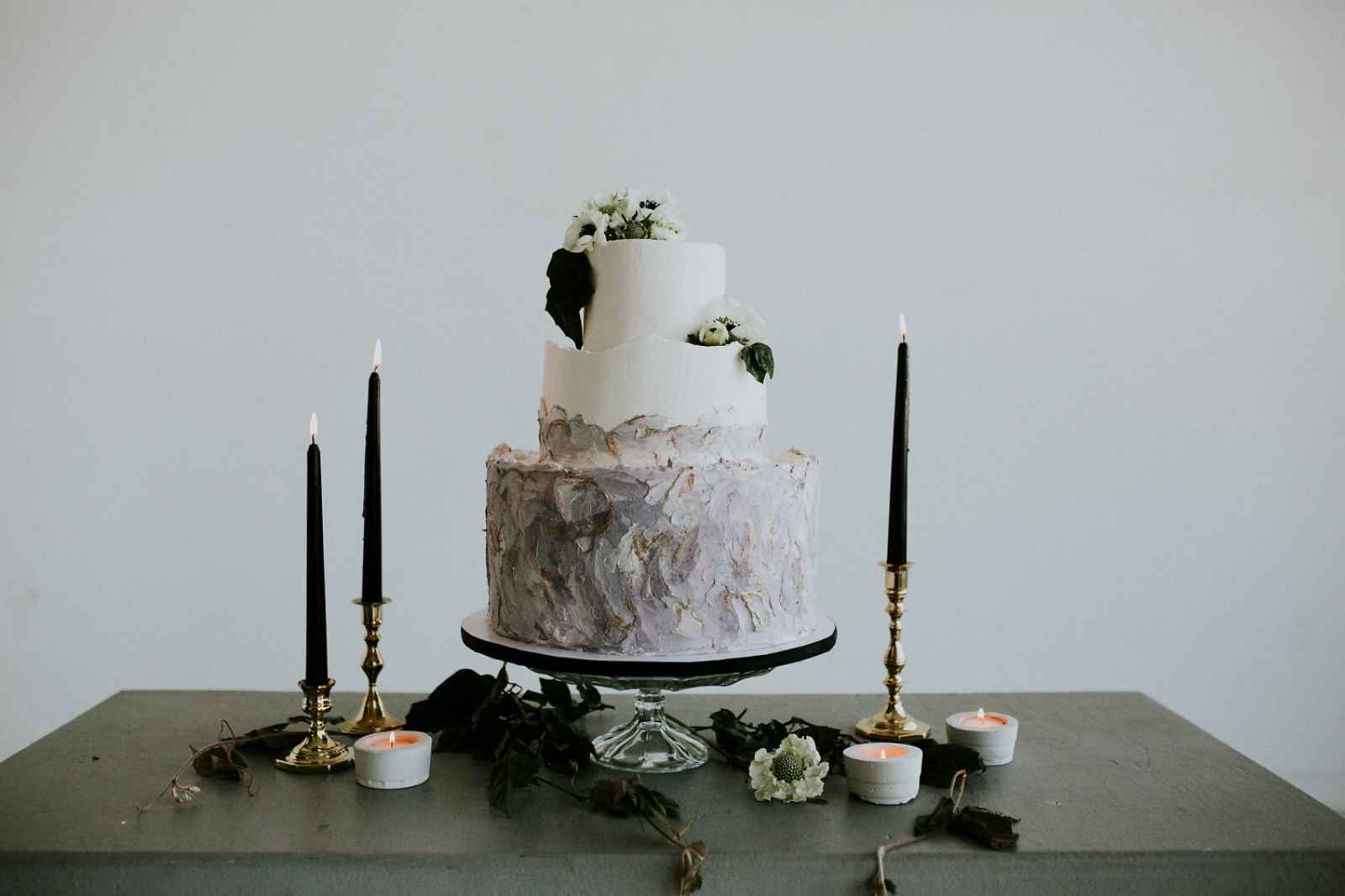
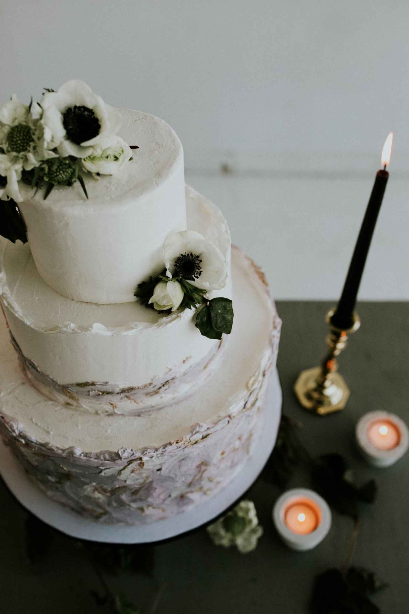
Design played a large part in the desserts as well. “When designing a cake I think about the space, the design, elements of decor and floral design. I also like to see the dress and wedding invitations, to really get inspired,” says Corinna Collins of Amalia Bakery Detroit. “I went with raw edges on the top of each tier, which was inspired by the Russell Industrial Center. The bottom tier and part of the center tier were layered textures using grays, purples and pinks. Metallic gold luster and edible glitter were added to make some of the textures really pop. The top tier was left simple and a few florals were added to finish it and make the design more organic.”
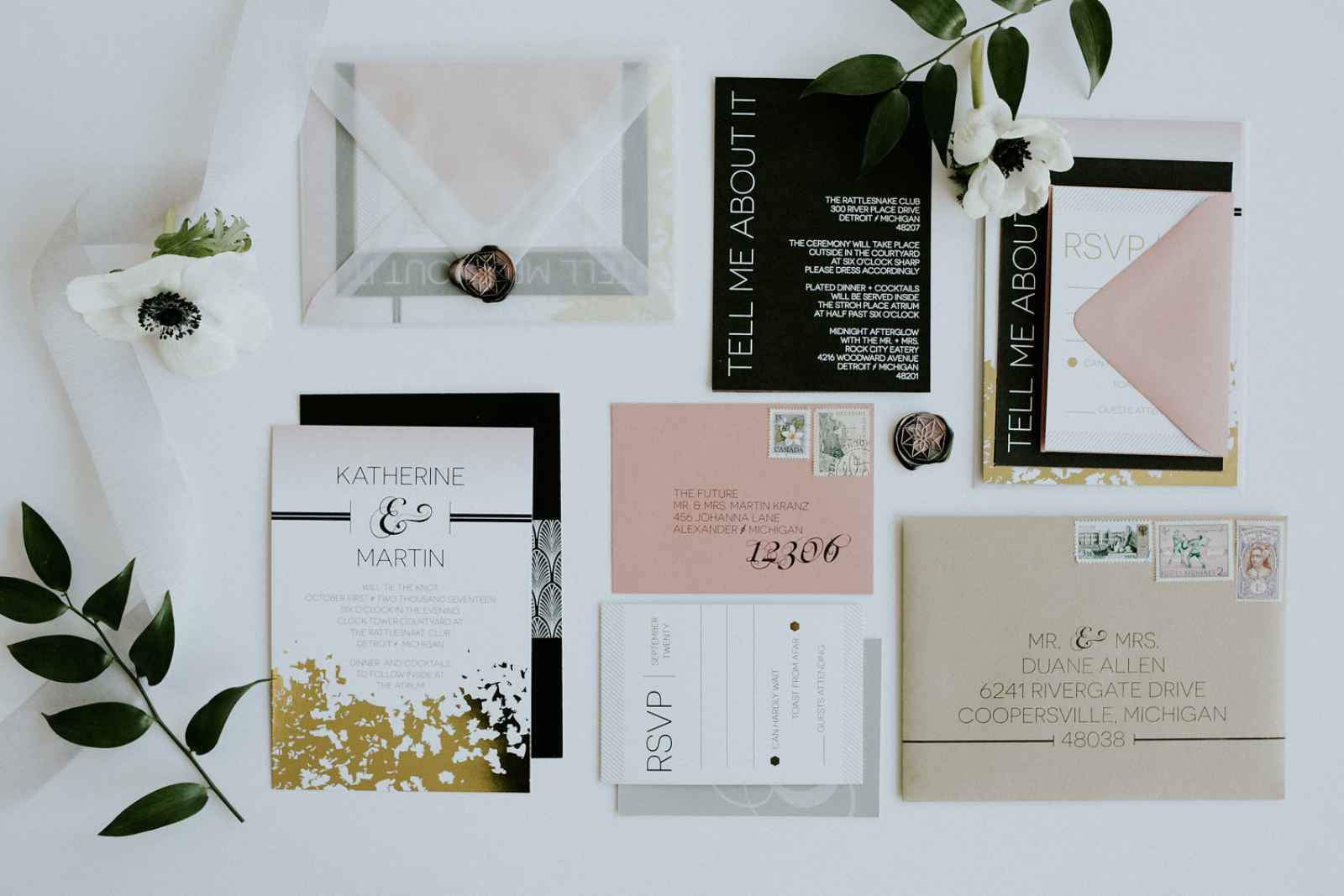
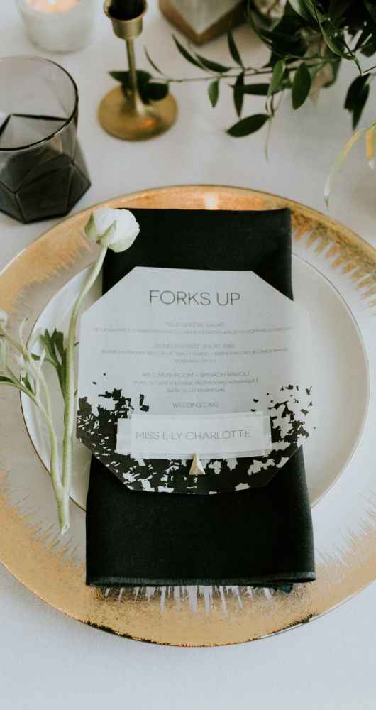
Keeping with the minimalist theme, Lyndsay Bullock of Cordial Punch Press paired a clean, modern design with an organic pattern and small, geometric details, and bold colors. “I wanted to do something a little unexpected so the whole suite was tucked into a vellum inner envelope and sealed with pink and black marbled wax seals, which were my favorite part of the suite,” explains Lyndsay. “I brought in additional color with the RSVP and outer mailing envelopes, and completed the look with vintage stamps.”




What We Love
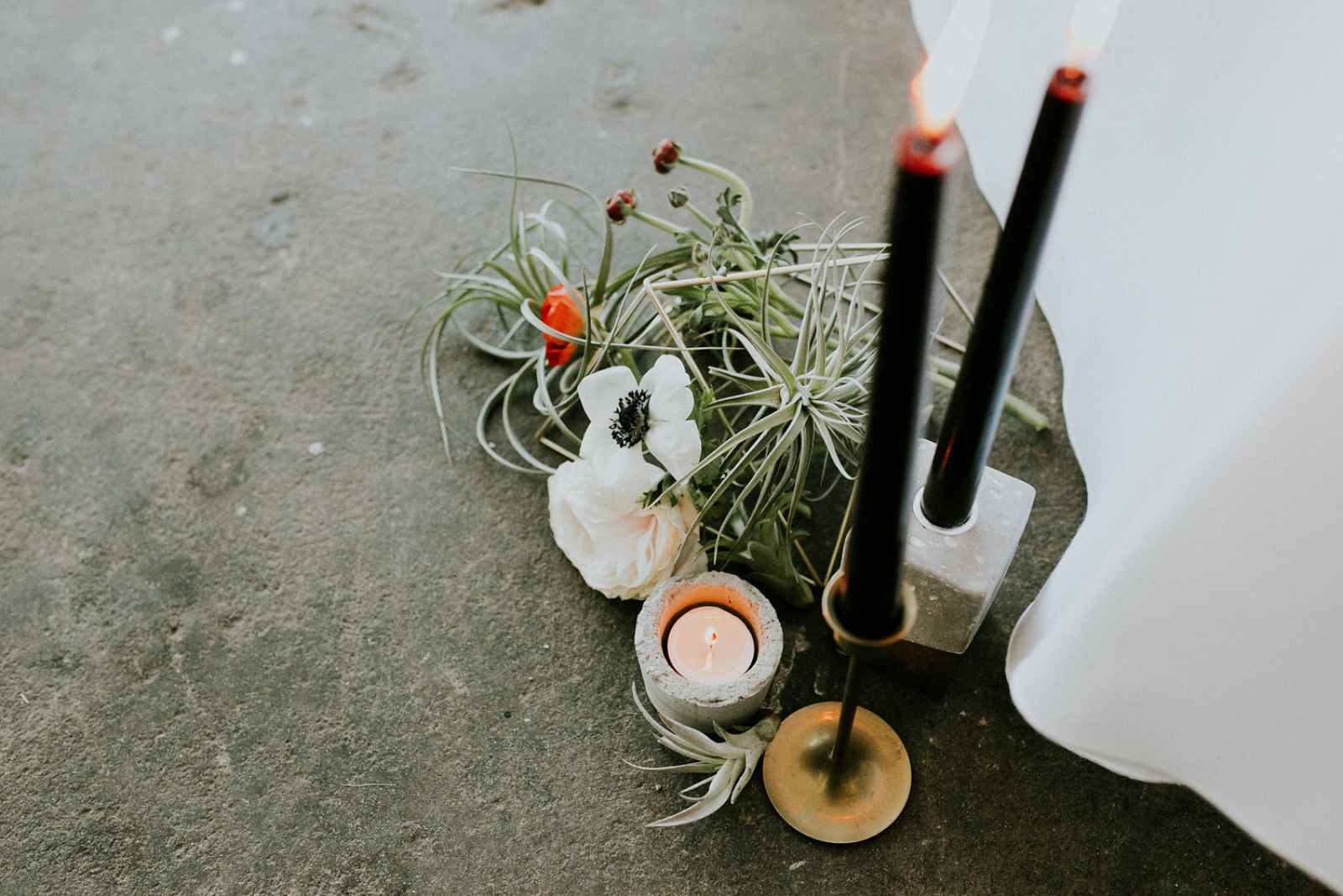
We love how this team creatively incorporated some very hot trends, including lots of greenery and unique lighting. “I think the gold candlesticks are a big trend right now, but we wanted to set them apart and make them a little edgier with the black tapers," says Miranda. "Erin also made these concrete votives, and I'm in love with them!”

are you a bride-to-be?
We'd love to plan with you on weddingday-online.com. Let's get started!
are you a wedding extraordinaire?
Join WeddingDay Magazine in inspiring brides by partnering with us! See how here.




Join the conversation
Log in or register to post comments